
Product Card Redesign
- Component Architecture
- Content Modeling
The product card was Provi The largest B2B online marketplace for the beverage alcohol industry, Provi connects users across the three-tier system to streamline ordering, inventory management, and payments.'s most-repeated, highest-stakes component, and every version of it had been created separately, with no shared structure to build from. Redesigning it meant fixing not just how it looked, but how it was composed.
Highlights
- Turned a one-off card into reusable, composable sub-components, enabling product displays to be assembled instead of custom-built
- Solved for information parity and more cohesive UX, removing a detour that was causing users friction
- Component approach was foundational in building out a white-label storefront experience in just 2 months
01 / Diagnosis
Not just a visual fix
Inconsistent product information was costing buyers time & money
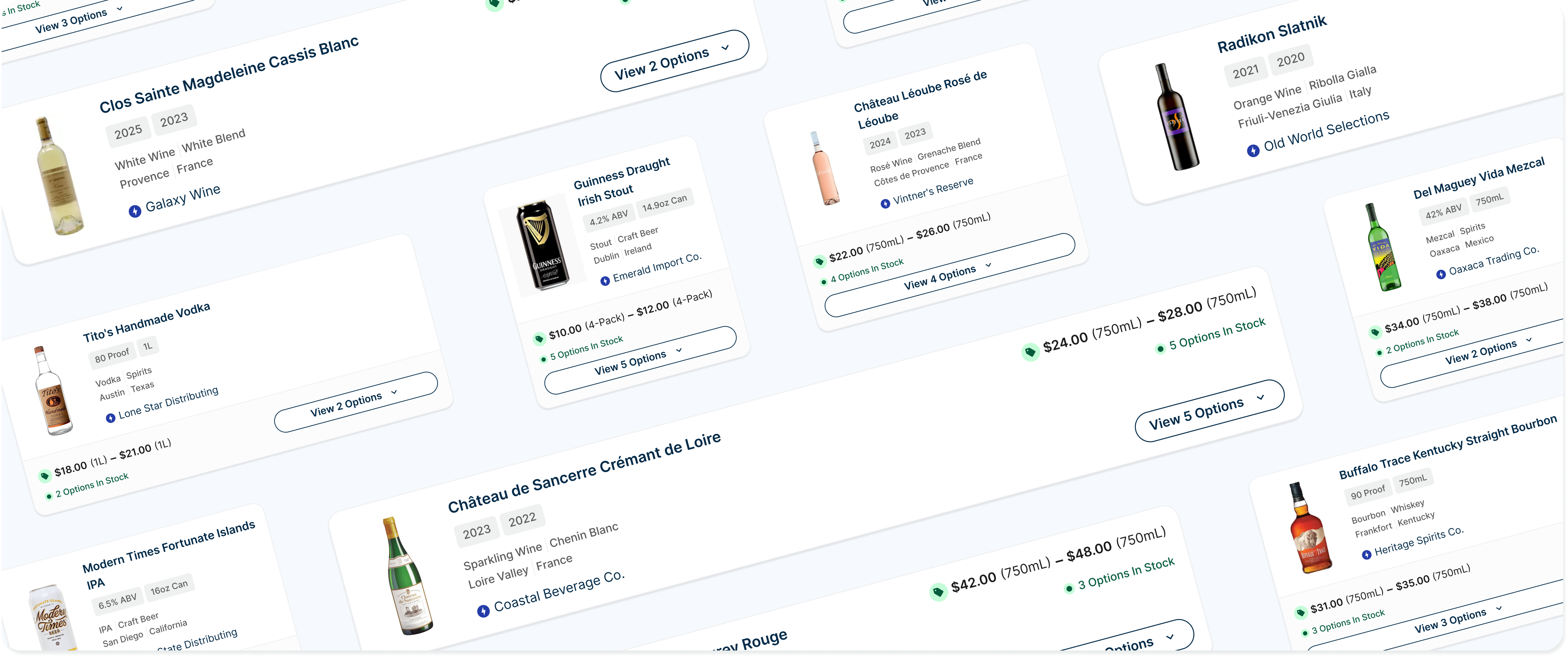
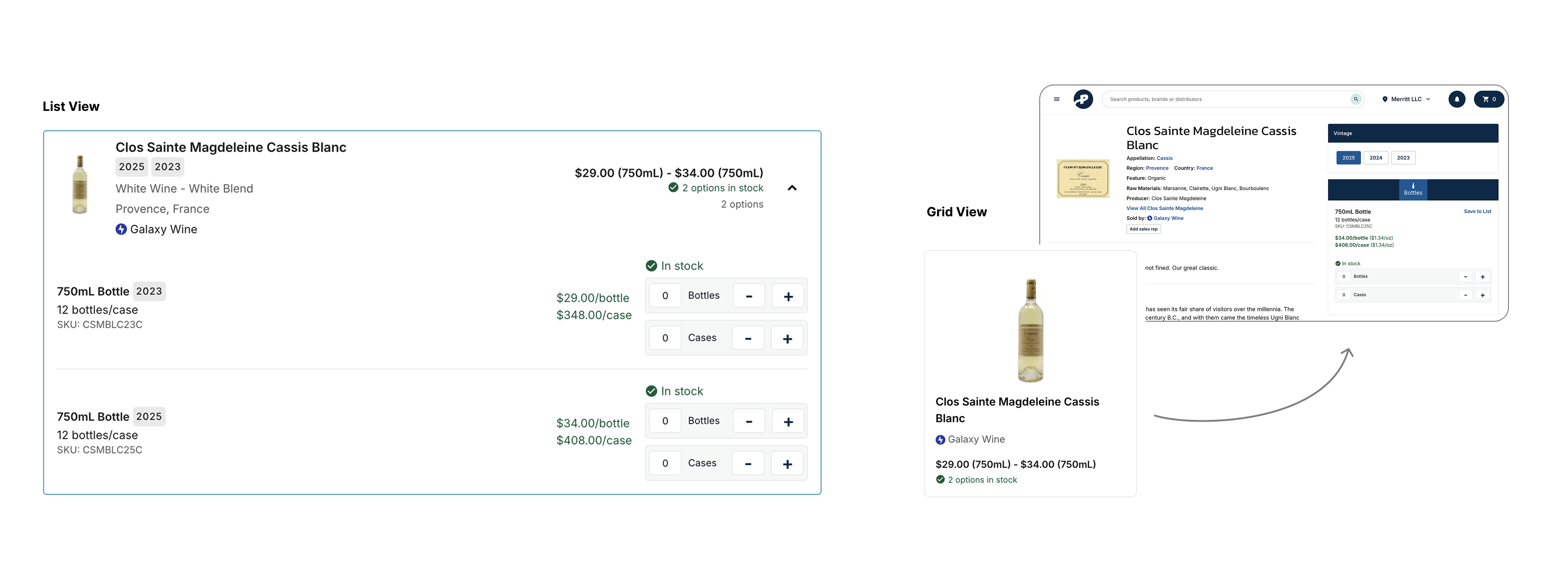
The problem presented as a visual refresh of cards, but I saw larger inconsistencies in how product information appeared across the site. Core product information was positioned differently depending on the context, and discounts weren’t reliably accessible. Inconsistency created friction for buyers.
02 / Content audit
Mapping product data
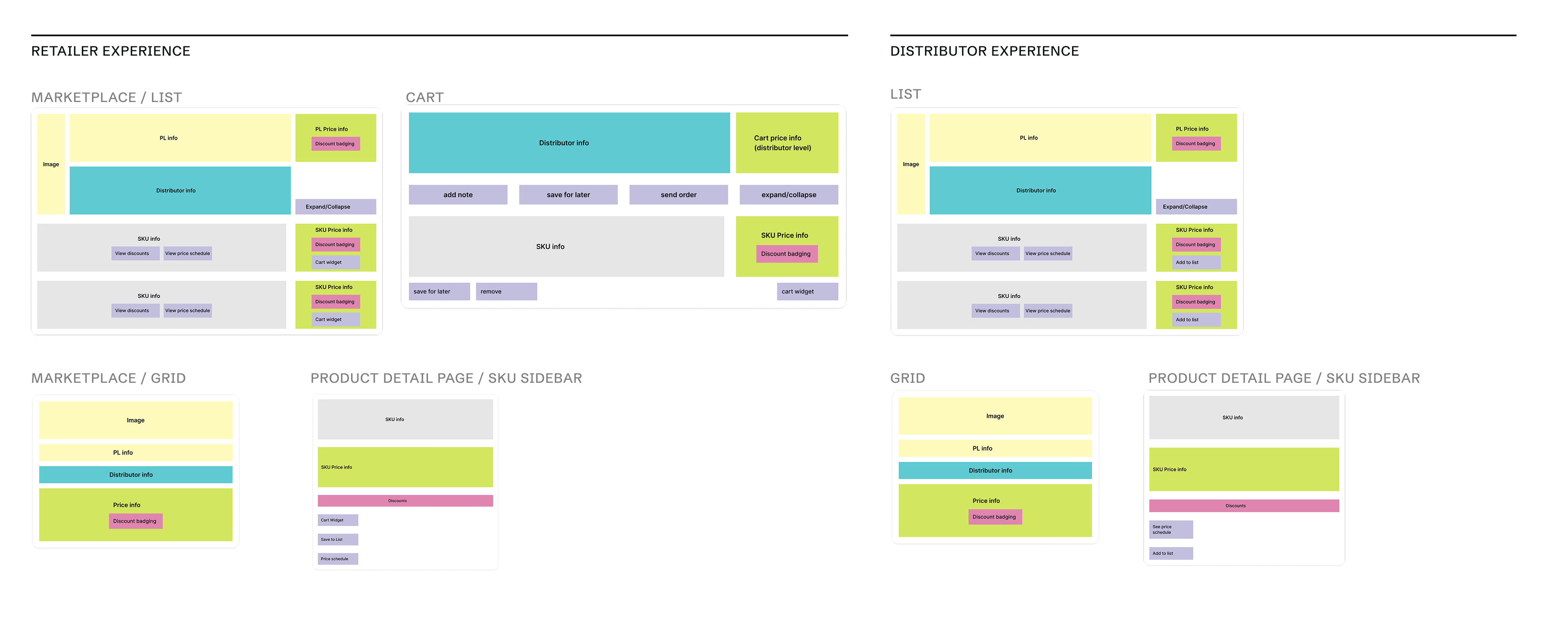
I audited every place product info and related actions appeared for both retailers and distributors, building a map of content across the experience.
03 / Component architecture
Composing from content, not containers
Cards became shells for reusable content components
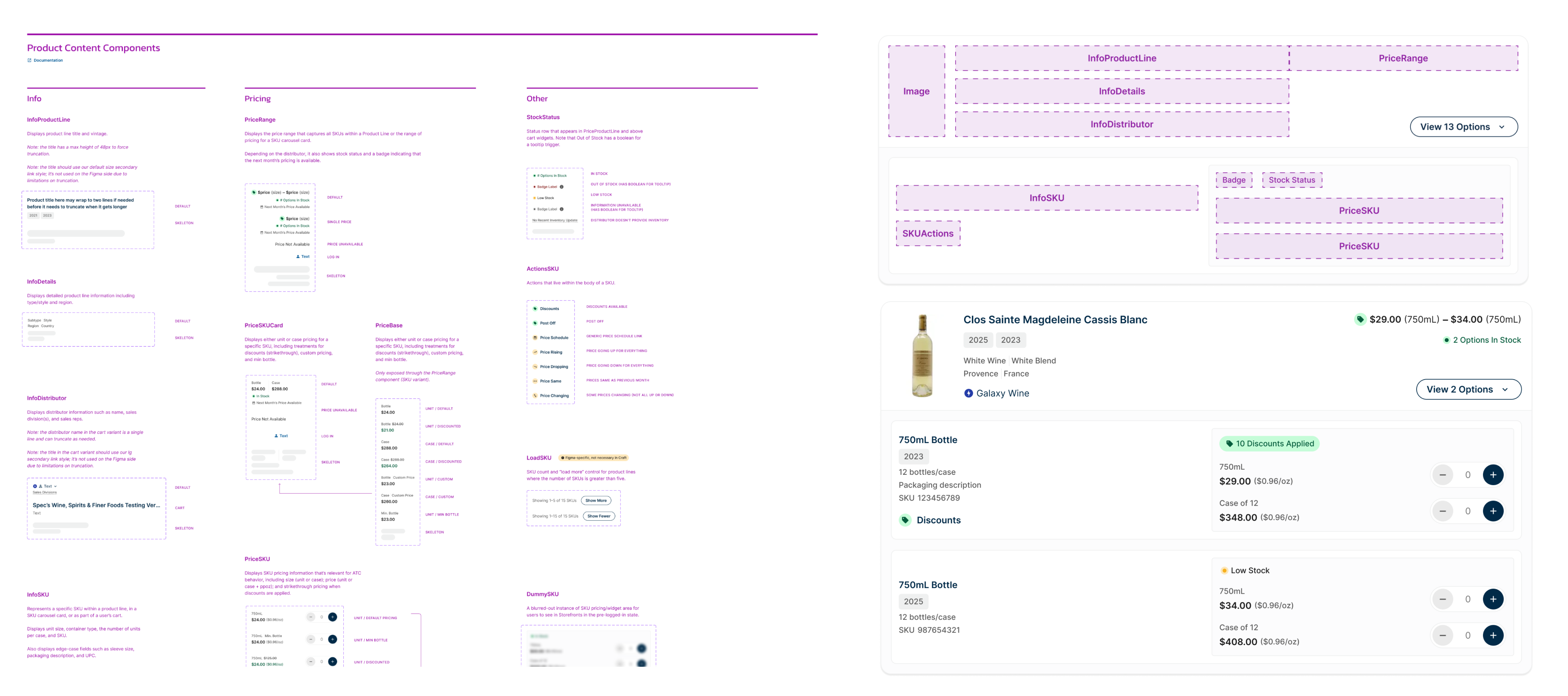
That content mapping led to a set of components that would allow Provi to more flexibly display product information: InfoProductLine, InfoSKU, PriceRange, PriceSKU, and so on. Cards themselves became shells that assembled these pre-defined pieces, meaning that anywhere a lockup of pricing, stock status, or distributor info appeared, it would look the same.
04 / Outcome
What a shared foundation unlocked
Information parity, discount visibility, and new ways to show product info
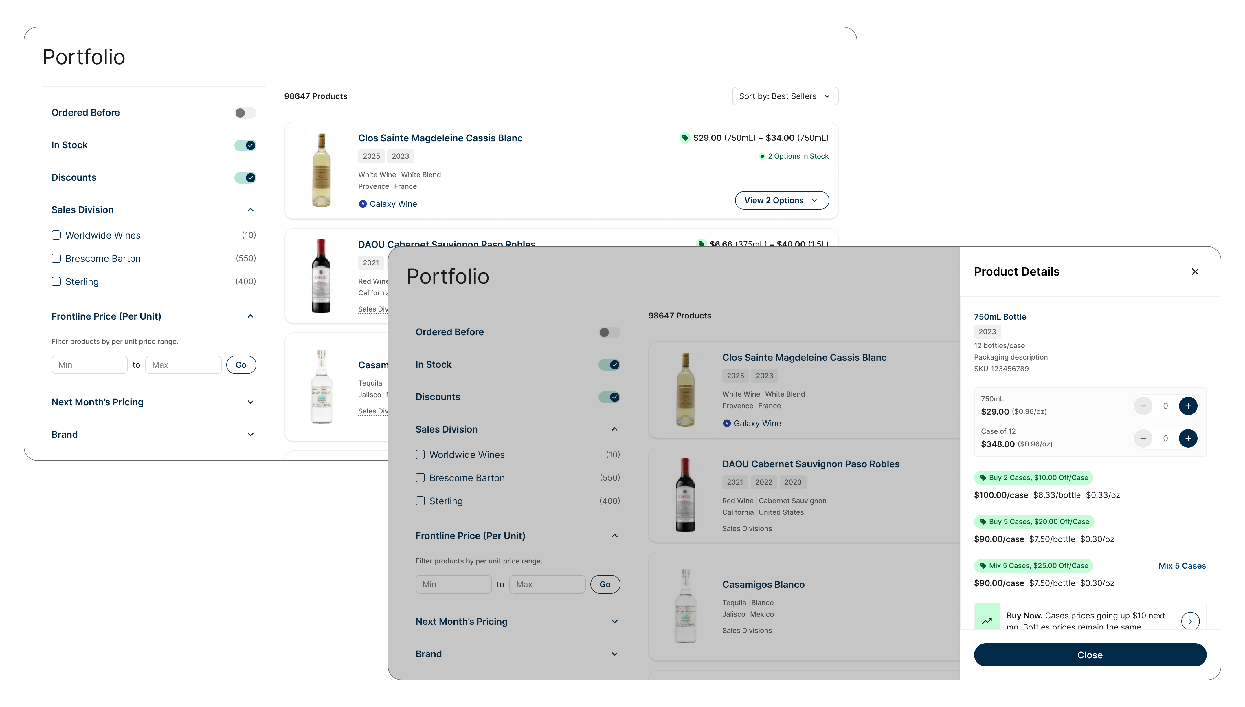
The redesigned card gave retailers and distributors visual and functional parity across list and grid views. Discounts became a more prominent element that was clearly visible per SKU. And with a fresh set of reliable, reusable content components, new displays for product information became unlocked, such as quick access to discounts and price schedules via a drawer pattern.
05 / Business impact
A new product build in 2 months
The hard part was already solved
Because I had built a robust system of components for product information display, a new white-label storefront product for distributors was built and launched in just under two months.