Craft Design System
- Design System Refresh
- Planning & Roadmap
- Education & Awareness
Provi The largest B2B online marketplace for the beverage alcohol industry, Provi connects users across the three-tier system to streamline ordering, inventory management, and payments.’s first design system was put in place without standards to help it scale, and over time it drifted, leaving a wide gap between design and code. A full rebuild was a big ask. I set the new system up for success with a transparent, collaborative process. Every phase, from visual direction to a proof of concept, was designed to build confidence along the way.
Highlights
- 0–1 system build with a dedicated engineering partner
- Built trust across the org with a detailed roadmap, sequenced rollout, and POC to validate ease-of-use
- Powered a new full product build in 2 months
01 / Visual direction
Upleveling the visual design
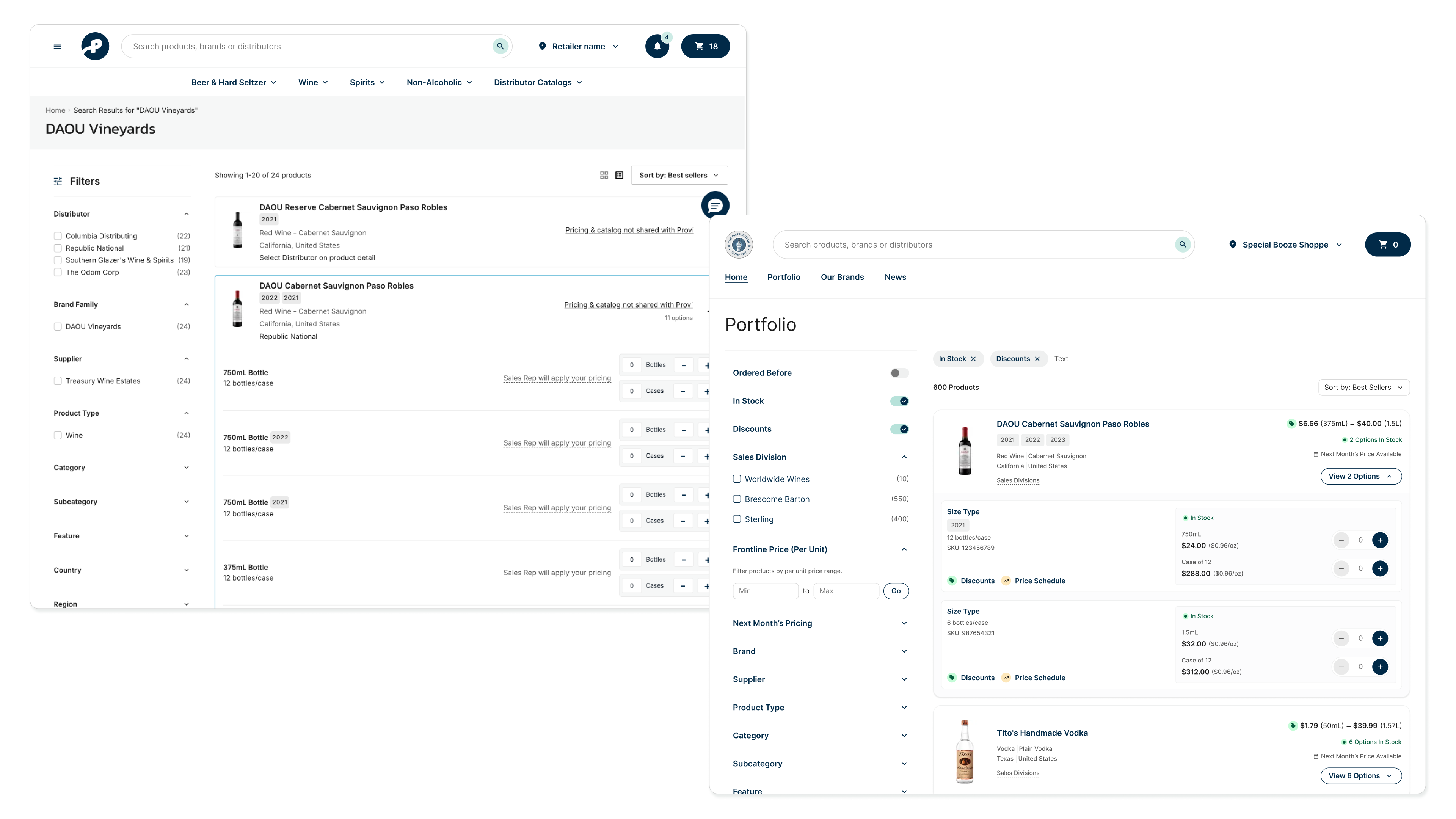
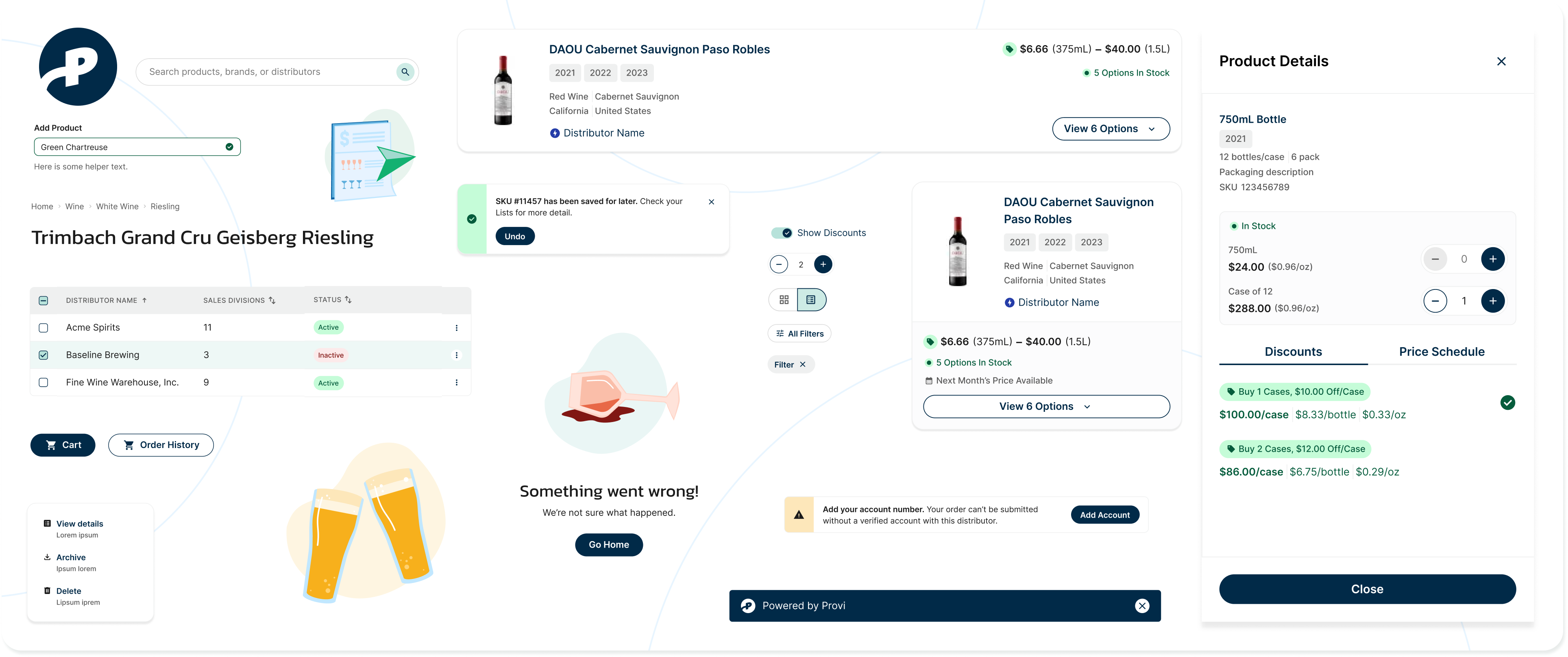
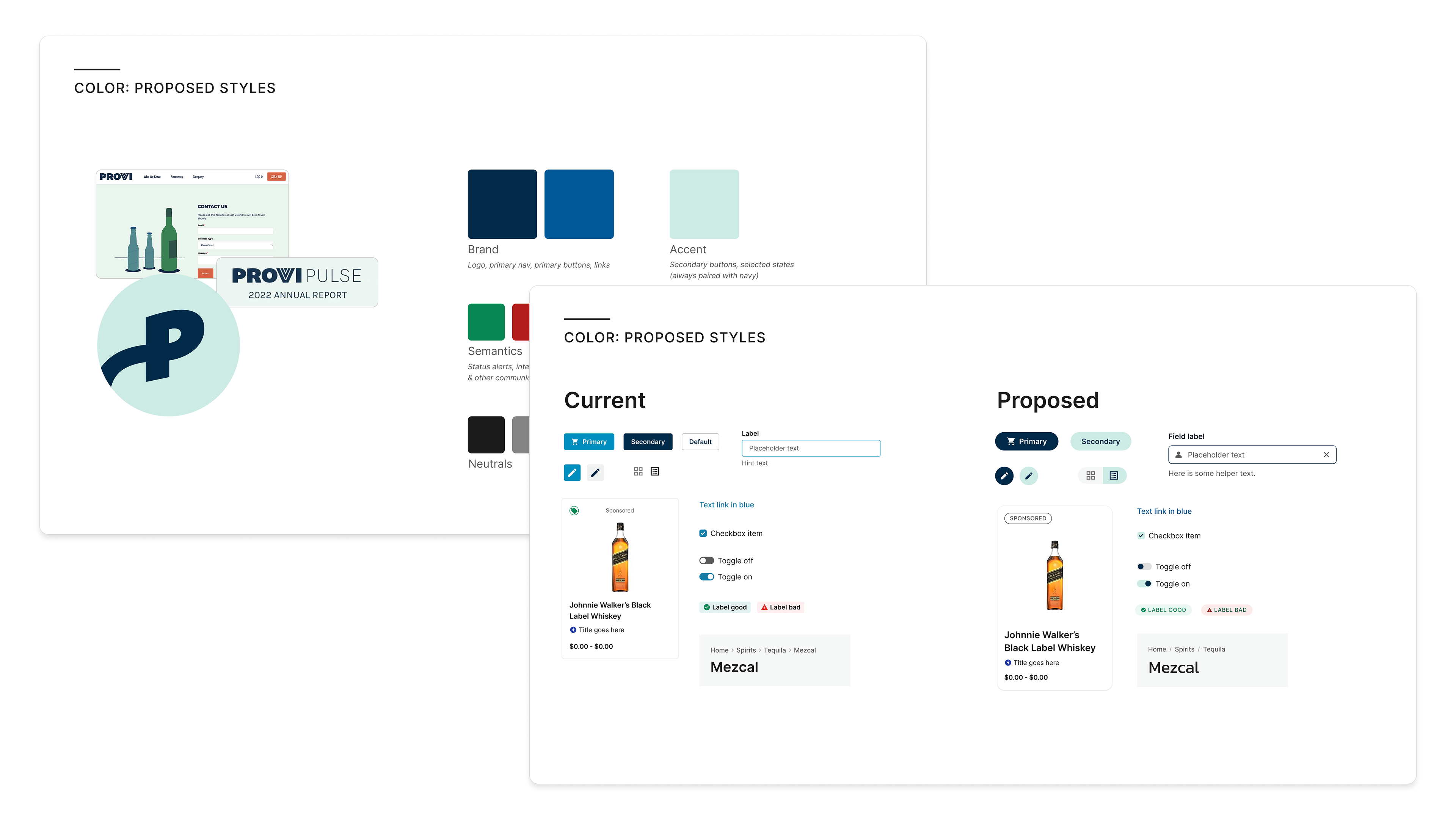
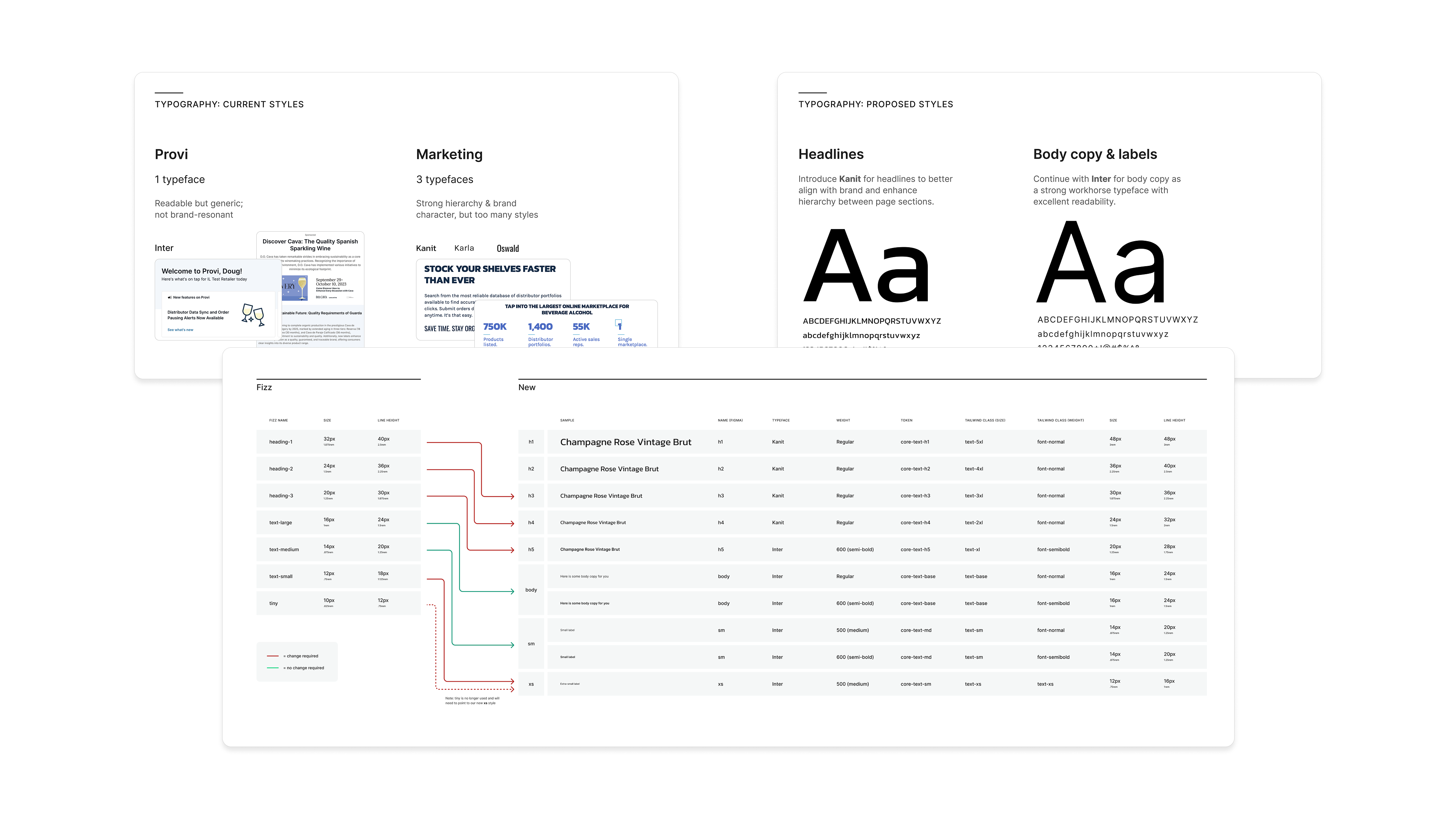
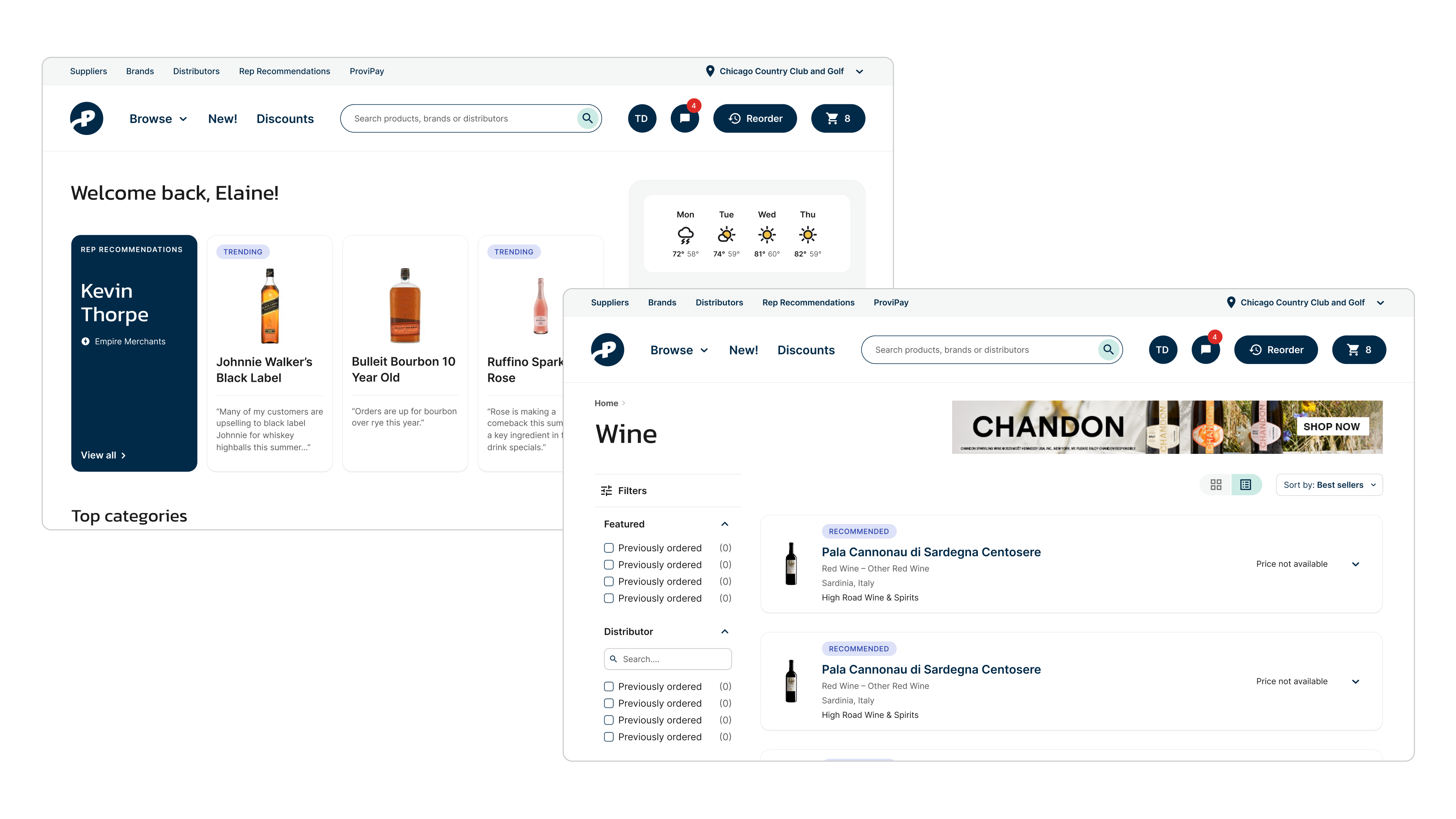
I worked across brand and product to get buy-in on a new visual direction. This included updates to color palettes, type scales, spacing, and corner treatments, alongside vision prototypes that imagined how the product might evolve with the new look & feel.
02 / Foundations
Setting scalable standards
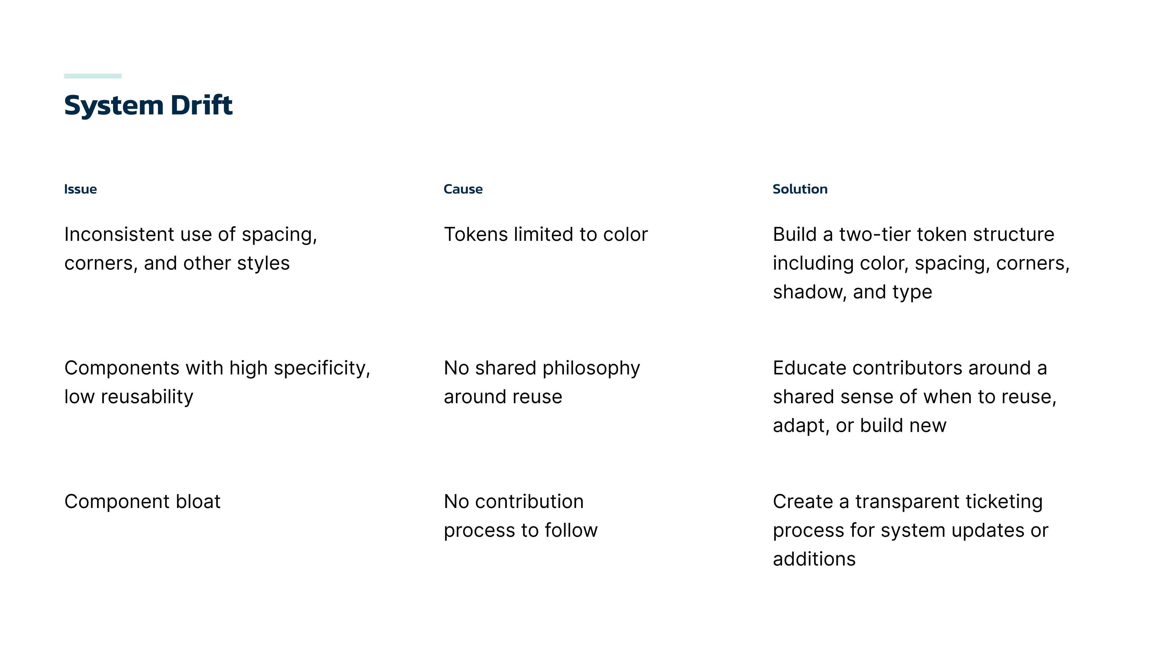
Tokens, contributions, and philosophy
The old system’s drift came from a lack of agreed-upon standards. I showed leadership how that weak foundation had caused the drift, and how setting those standards now would help the new system scale and enable teams to build a better product faster.
03 / Accessibility
Accessible by default
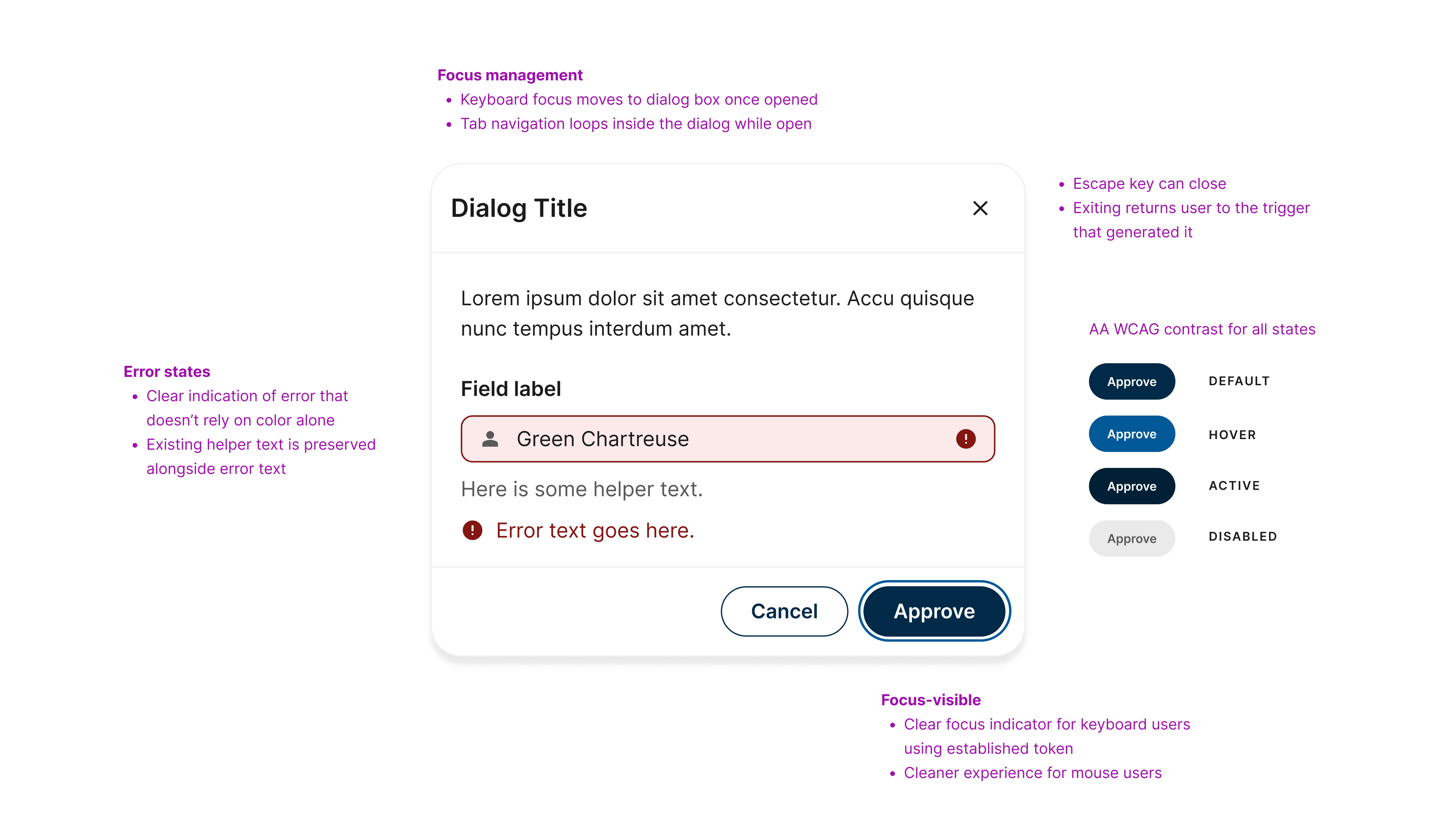
I set WCAG AA as the target for Craft and treated accessibility as a requirement for every component. That meant color considerations including edge cases like disabled and error states, and how focus and interactions worked for keyboard users.
As a principle, it meant treating accessibility as a spectrum that benefits all users, not just a safety net for a subset of people.
04 / Planning & roadmap
Making the plan visible
A detailed roadmap with clear milestones
Product & engineering leadership was keen to understand how we’d approach a rebuild and when other teams might be enabled to tackle new work.
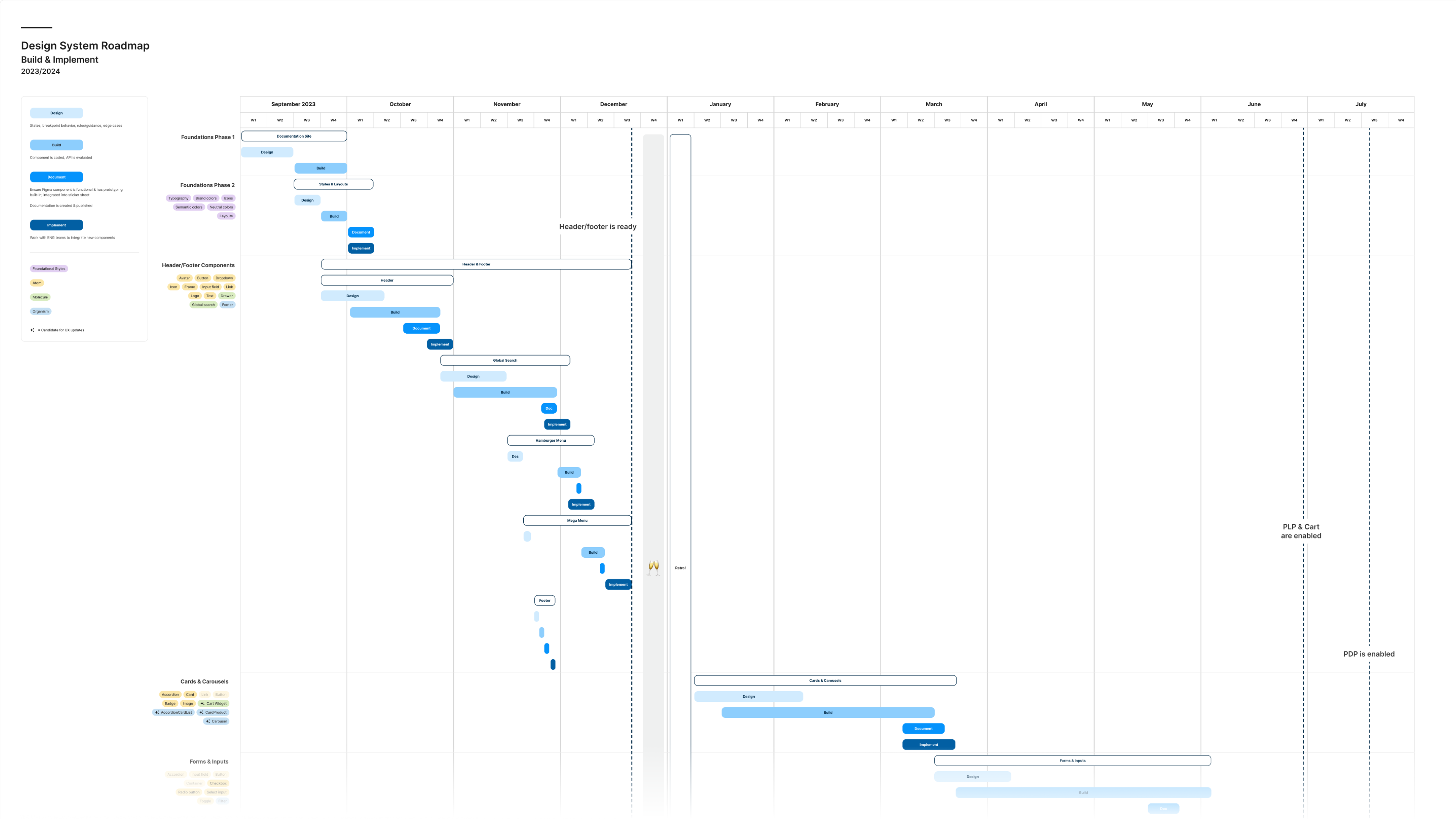
I sequenced the rollout in phases based on estimates across foundational work and component efforts (design, build, and QA). Dubbed “Thundergantt,” this view demonstrated what could be built and when, with gates along the way indicating which sections of the product would be unlocked. This work was then migrated to Jira as tickets that could be tracked and measured.
05 / Validation
Proving the work
The global nav as a soft launch
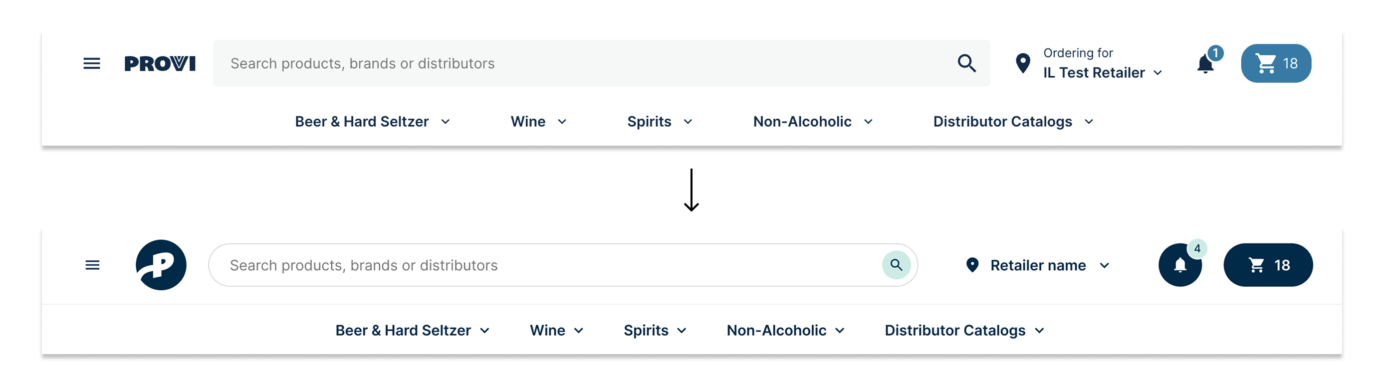
We validated Craft through a redesigned global nav to test engineering ease of use and make sure usability didn’t slip. Click tracking confirmed that usability was as good as or better than the original. Engineers found the system easy to work with, and they also flagged a few improvements to components that had too much business logic baked in.
06 / Education & enablement
Building system fluency & adoption
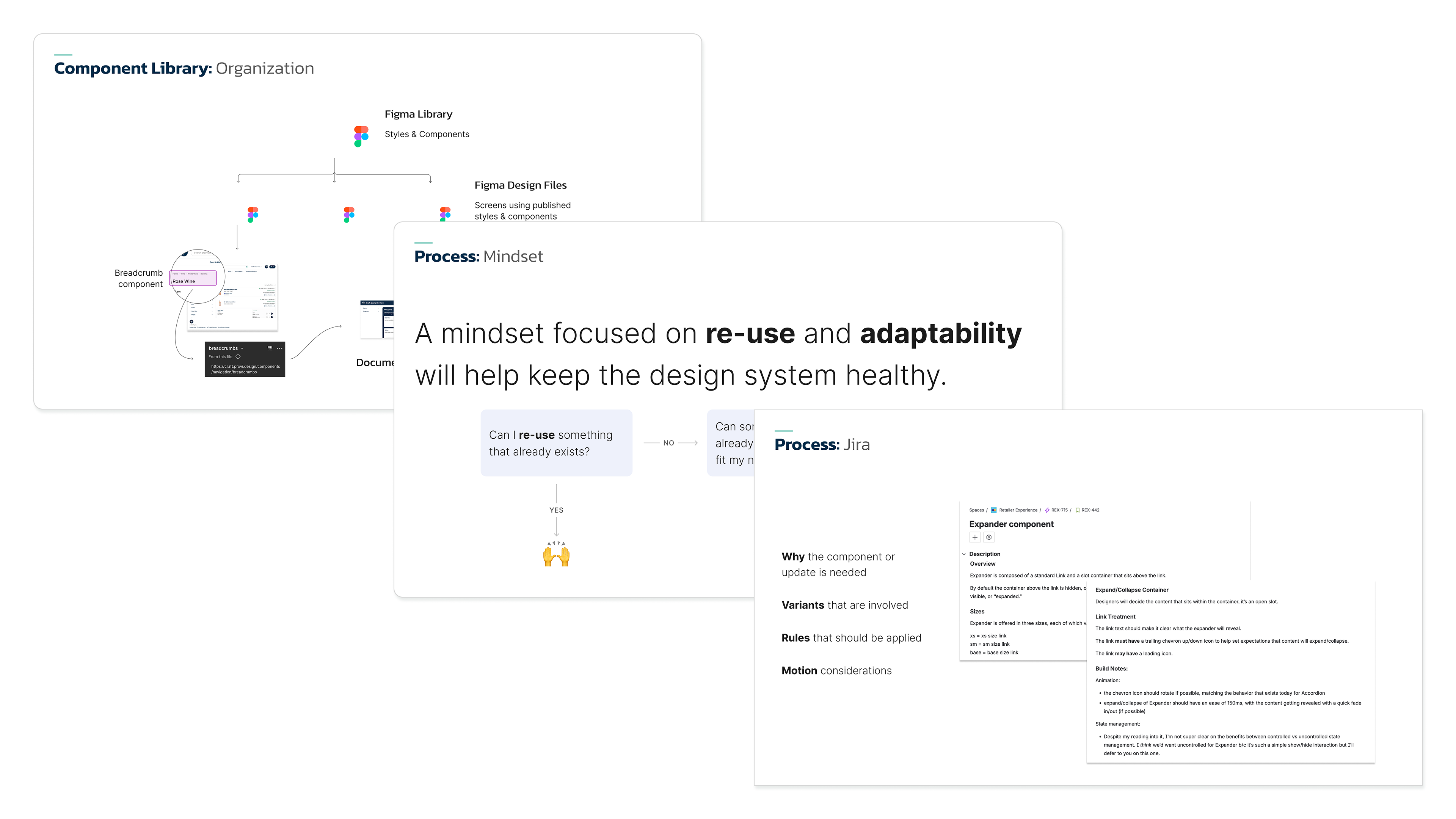
I ran recurring sessions with designers and engineers on when to reuse, adapt, or build new, and how to contribute and hand off. The goal was a team that could support the system, not just consume it.
07 / Business impact
A full product build in two months
Confidence turned into speed
With leadership backing and a validated system in place, Craft powered a new product build — a white-label distributor marketplace built on Provi — that shipped in two months.