
Sendoso Campaigns
- Product Design
- B2B E-Commerce
Sendoso is a corporate gifting platform that enables sales and marketing professionals to send personalized gifts at scale to build relationships and close deals.
Gifts were often sent as campaigns, branded as “Touches”, that were cumbersome and lacking in expected functionality. Gift browsing had no real e-commerce experience, gift selection was rigid, and campaign configuration left users unsure whether their settings had even saved.
Highlights
- Shipped a new e-commerce browsing experience that drove a 12.3% increase in campaign creation through the new flow
- Reorganized configuration settings based on real evidence from user feedback and analytics
Problem
Touches are created by admin-level users, such as marketing managers, as something they can measure and track as other users in their org send gifts. For example, a manager might create a Touch that allows their team send out coffee gift cards to sales leads as an incentive to book meetings. They might configure this Touch to be active for a set period of time and only allow certain team members to send against it.
Touch categories included eGifts, physical gifts, and experiences.
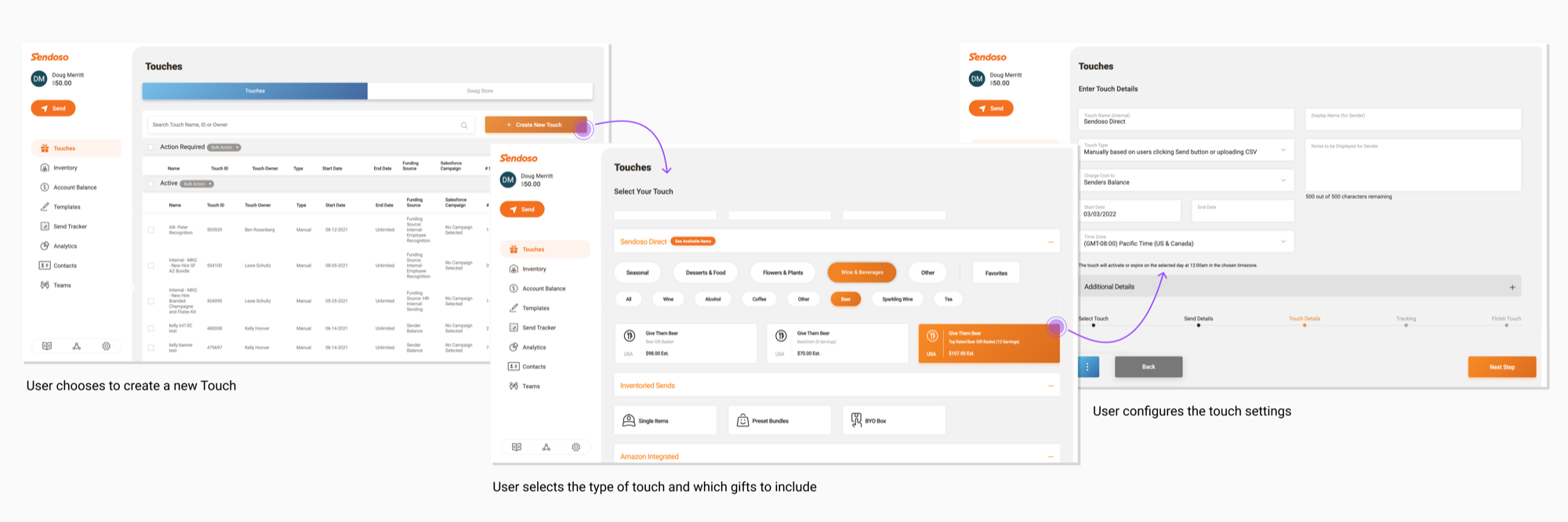
If we could reduce friction in creating Touches and add more flexibility around gift selection, users will create more Touches which enables more gifts to be sent.
A real browsing experience for gift selection
Customers were stuck using an early MVP flow that lacked the look & feel of a true e-commerce experience.
Naming clarity
“Touches” wasn’t a term that resonated with customers, making the feature harder to discover.
More flexibility in gift selection
Gift selection was rigid, with many Touches limited to a single gift. If you wanted to send multiple things, you needed multiple Touches.
Confidence in the flow
Users were never quite sure that their choices were being saved across the configuration flow.
Process
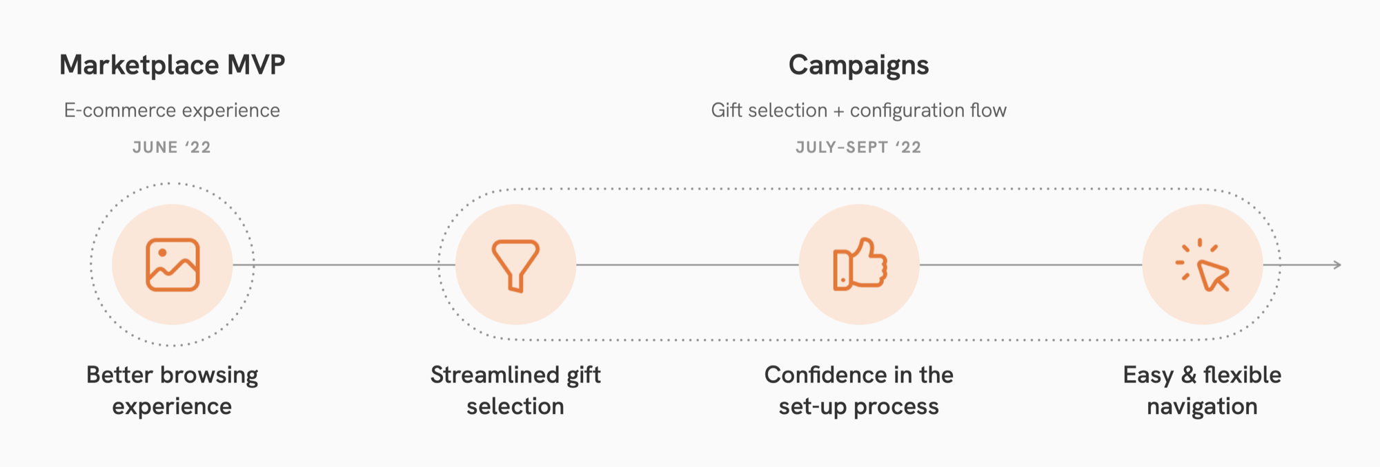
We prioritized the work in order of impact. Build an MVP gift browsing experience first, then add clarity around naming, followed by improved gift selection and configuration.
Marketplace MVP
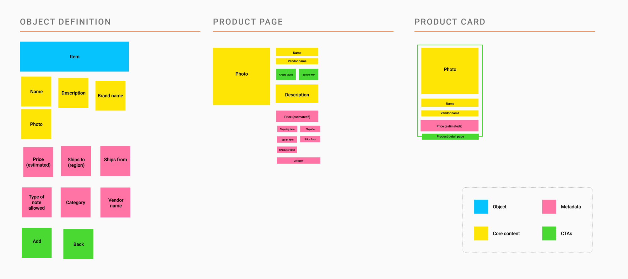
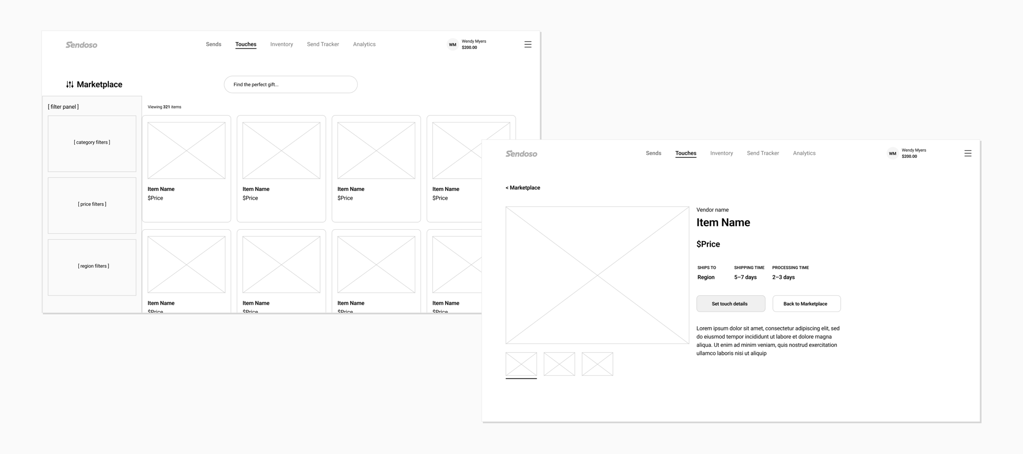
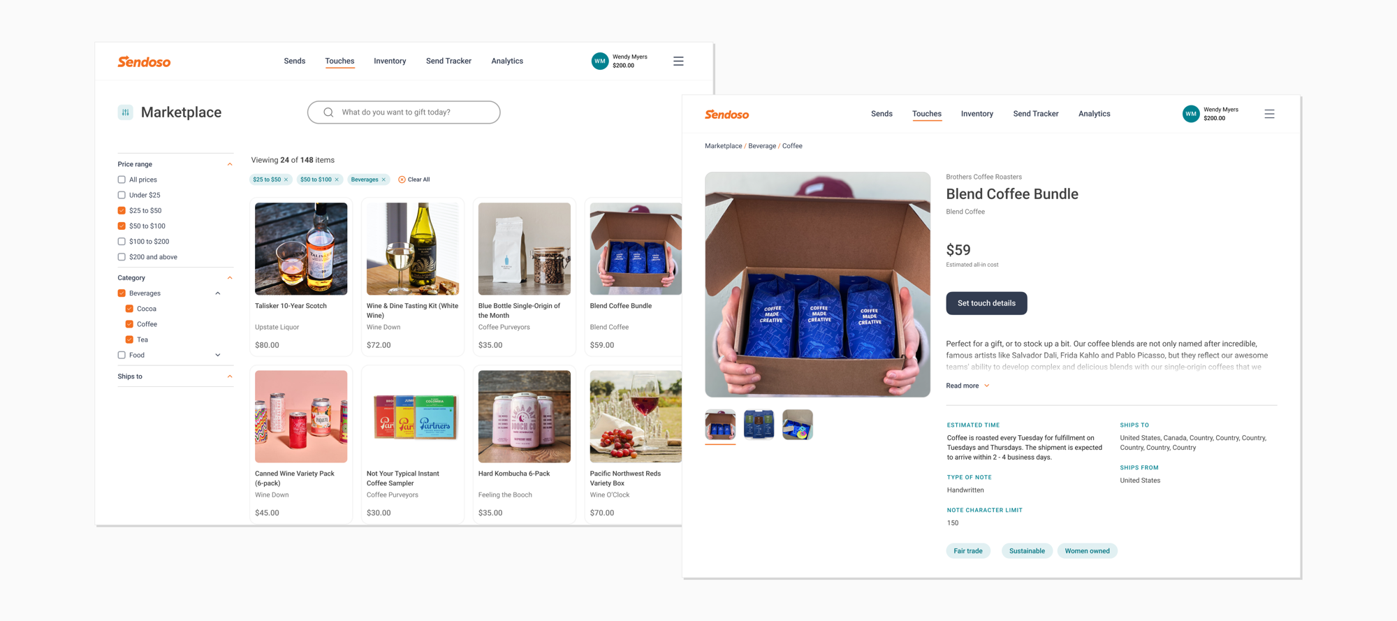
The physical gift Touch category was the focus for the MVP. It was a popular category with users and had a wide selection of gifts with images and metadata that would serve as a proving ground for the e-commerce experience.
I partnered with product and catalog teams to define what data product cards and detail pages needed, prioritizing basic filters for launch and backlogging advanced ones based on user feedback.
Touches → Campaigns
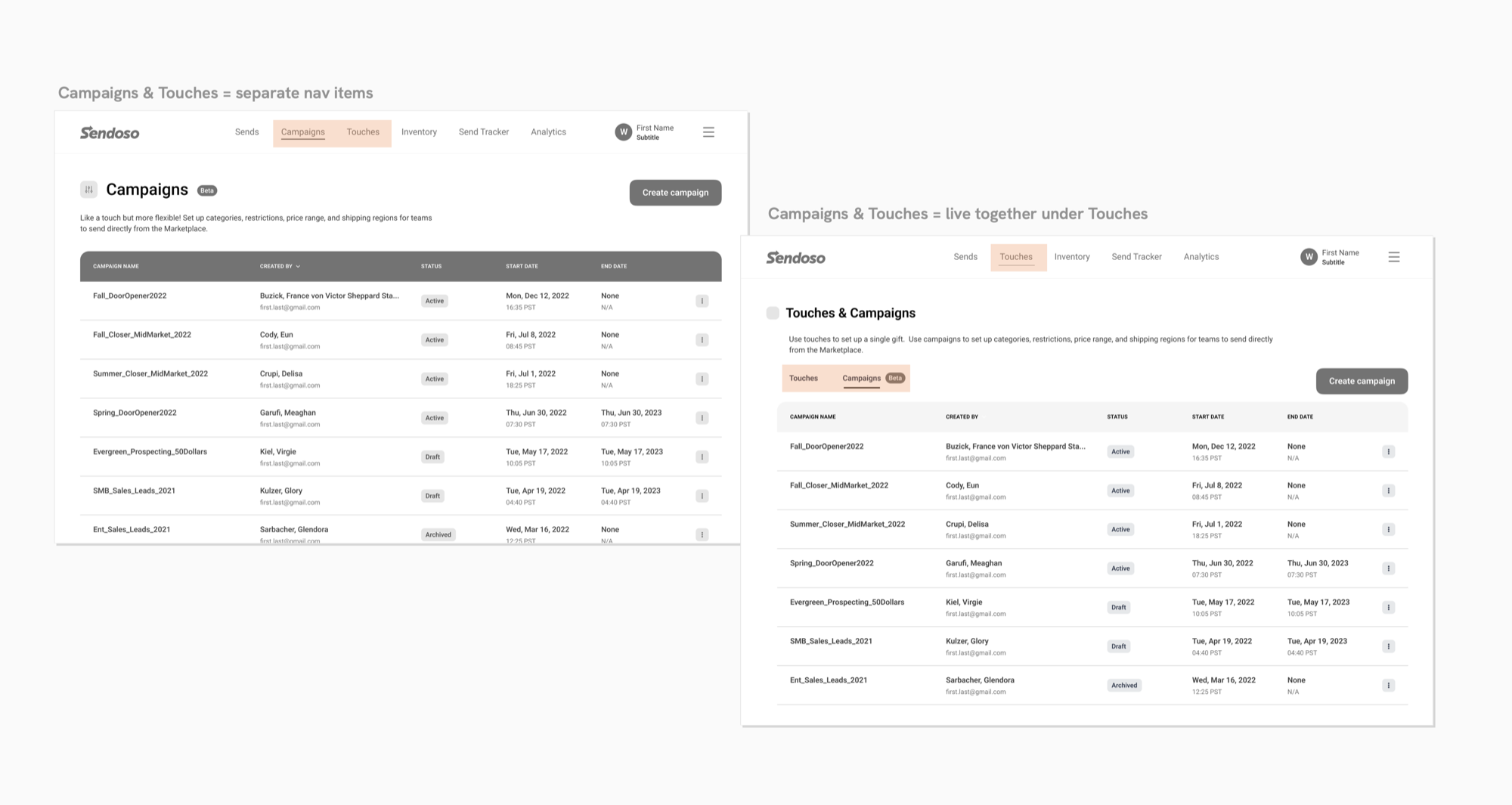
Touches were only built to accommodate a single direct gift item. We needed a new construct that would allow multiple gifts or a set of gifts defined by certain criteria. This meant not only renaming things to the far more descriptive “Campaign” title, but also solving for how users might navigate these two similar (but functionally quite different) options. Until all the old Touches could be migrated to Campaigns, the two would need to live side-by-side.
Gift flexibility
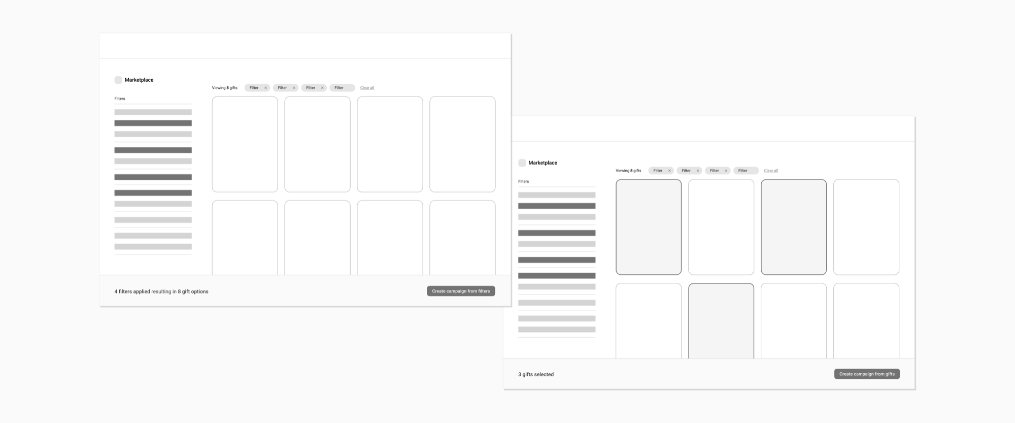
We wanted users to be able to enter a marketplace and either select a set of gifts for their campaign, or set some rules for their campaign that would capture a range of items, such as “food & beverage gifts under $50.”
I first explored a more open-ended gift-selection model that offered up a contextual CTA based on behavior. If you filtered the view based on certain criteria, you could create a campaign based on those filters; if instead you multi-selected different gifts, you could create a campaign with those specific items. But this flexibility actually added complexity.
Instead, I settled on a cleaner approach where users chose a campaign type first (gift-based or criteria-based) and the marketplace adapted around it. Not only did this feel more straightforward, but it would be easier to build.
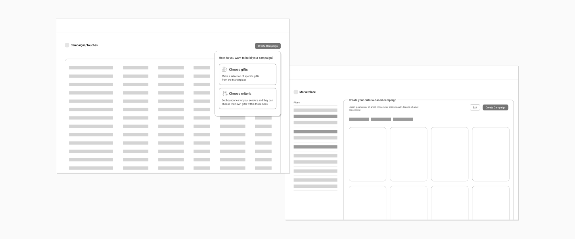
Campaign configuration
Finally, I tackled the configuration of a campaign once gift selection had been made in the new marketplace. I worked with my PM to understand all of the settings across all Touch types first, and then focused on the physical gift category for this new campaigns approach. We leveraged analytics data and past feedback to better understand settings priority and step order.
I then approached the flow more structurally, thinking about zones and how to best handle basic versus advanced options.
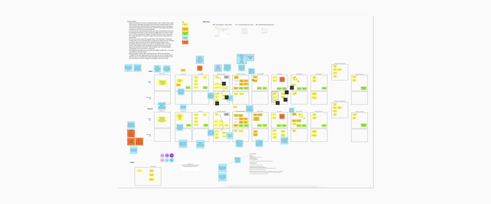
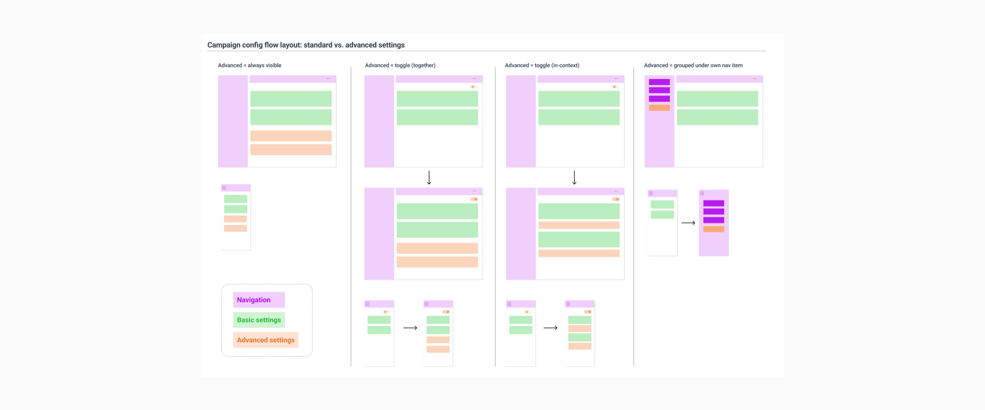
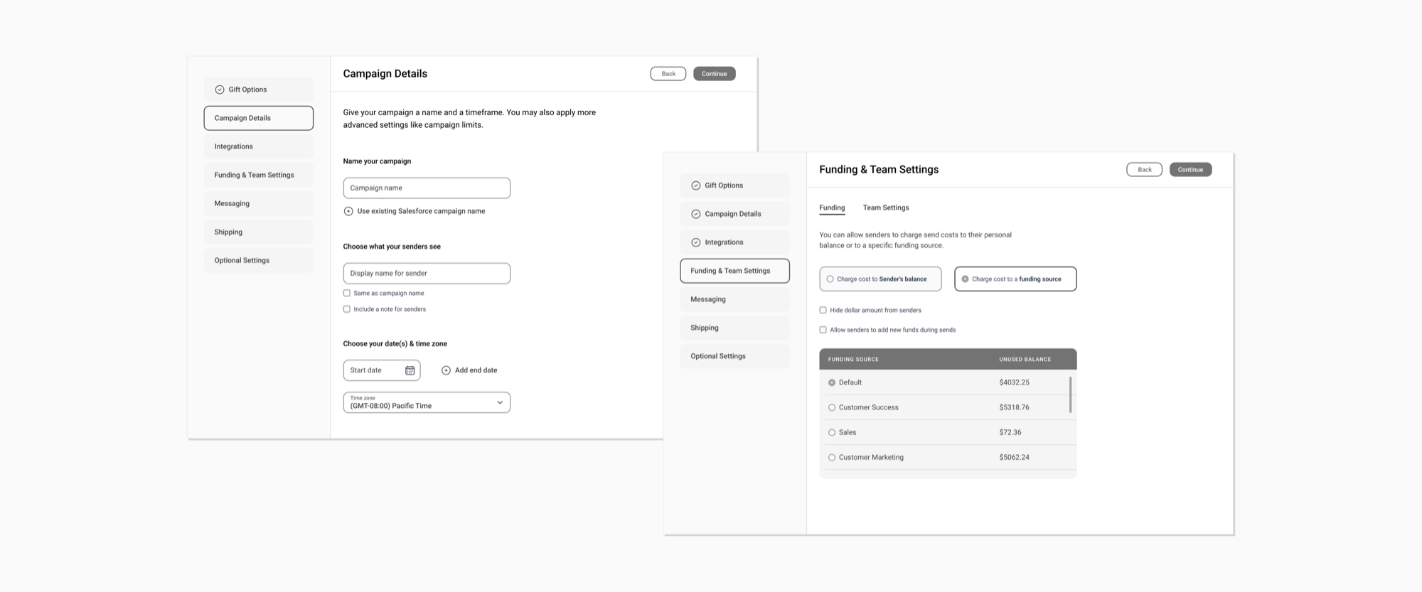
Prototype & testing
I built a polished prototype for usability testing that covered the range of updates: Touch/Campaign renaming, the gift selection experience, and the configuration flow.
Outcomes
Usability testing
Users were comfortable choosing a campaign type prior to entering the marketplace. The configuration flow provided reassurance that settings were saved along the way and the sequence of steps resonated with users. However, jumping from a more visual marketplace experience to the configuration flow felt jarring.
The Touch → Campaign naming was a challenge. They weren’t too concerned about the actual name, they just wanted all campaign types in a single location.
Marketplace launch
The marketplace launched successfully with plans to update it to accommodate additional types of campaigns. The improved browsing experience bumped Touch creation up 12.3% compared to the previous disjointed experience. After 6 months, Touches created by users browsing the new marketplace were up 17.6% as compared to the other Touch categories using the existing flow.
Campaigns on hold
Unfortunately the campaigns effort was put on hold after a round of layoffs. But we validated a new way for users to browse gifts and configure campaigns. With further updates this flow could serve all Touch types as they are migrated over to the new campaigns model.
Takeaways
Simple beats flexible
My initial approach with the gift selection phase of a campaign was trying to do too much at the expense of simplicity and speed. Users were ok first selecting their type of campaign — gift-based or criteria-based — rather than face shifting CTAs based on how they were browsing the marketplace.