Cigna Digital Customer Experience
- Product Design
- Research & Discovery
- Healthcare
Cigna is a major health insurer with over 185M customer relationships in over 30 markets.
As more customers move onto high-deductible health plans, the stakes for making informed healthcare decisions are even higher. Failing to stay proactive and getting care out-of-network drives up costs for everyone. Through a set of projects over a multi-year engagement, Cigna partnered with us to explore how we could provide the right guidance to customers at the right time to move the needle on better care and lower costs.
Highlights
- Built Cigna's first proactive guidance product, lowering healthcare costs for regular users by 25% on average
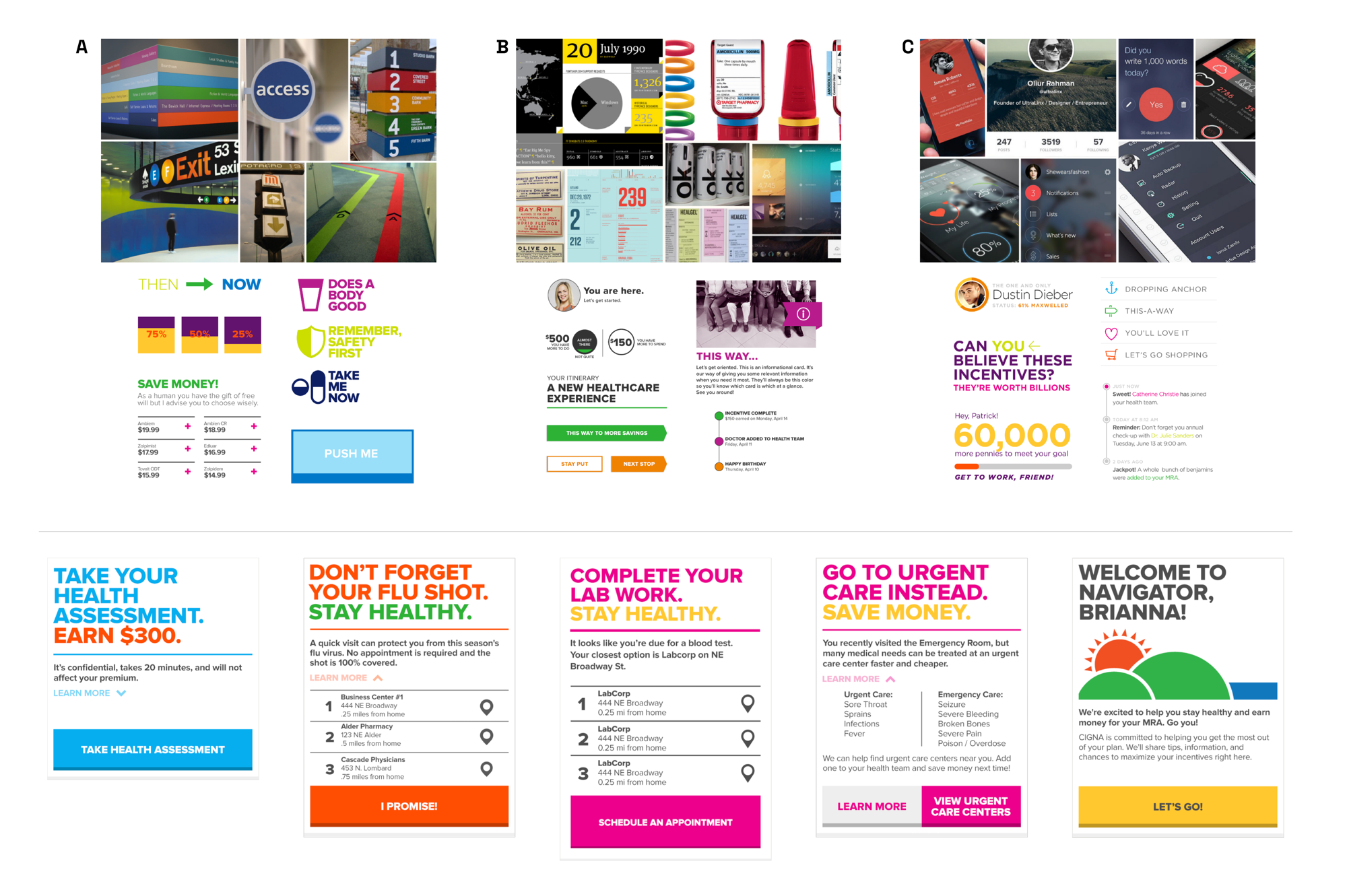
- Used research insights to shape visual design and voice & tone, not just the feature set
Problem
Many employers have shifted to offering plans with higher deductibles as a way to save on costs. These plans work best when consumers are proactive with their care and stay in-network. This saves on costs for everyone, but it can also lead to better healthcare outcomes for consumers.
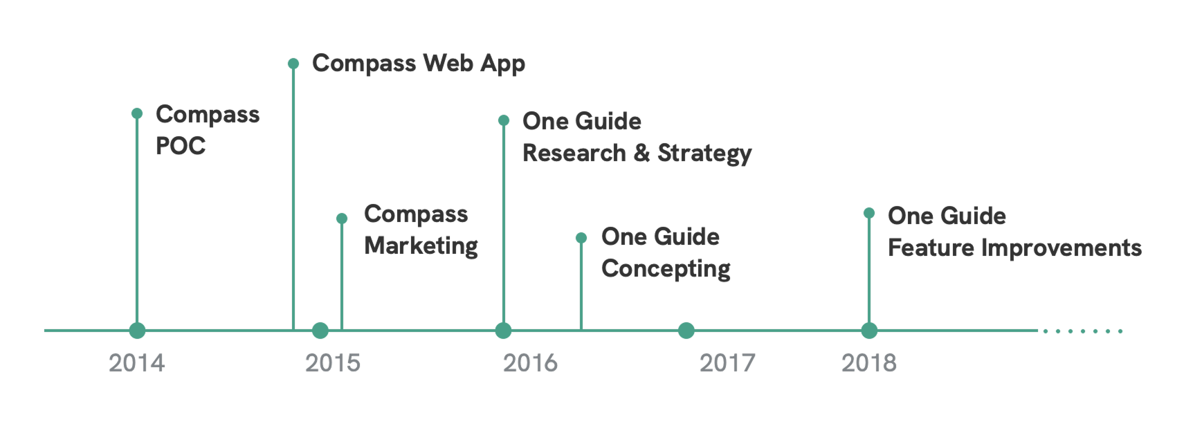
Cigna’s existing digital experience was built more for plan management than deciding what to do next. Over a multi-year relationship, they asked us to explore how digital solutions could make for a better healthcare experience. This came to life in two products: Compass and One Guide.
Process
Compass: Card Model MVP
Cigna’s largest enterprise client with over 200,000 employees was a strong candidate to validate a more proactive approach to healthcare messaging.
Through customer interviews across three risk profiles, their experiences kept surfacing the same thing: there’s too much information and not enough guidance. This became a core theme behind a mobile-first web app called Cigna Compass.
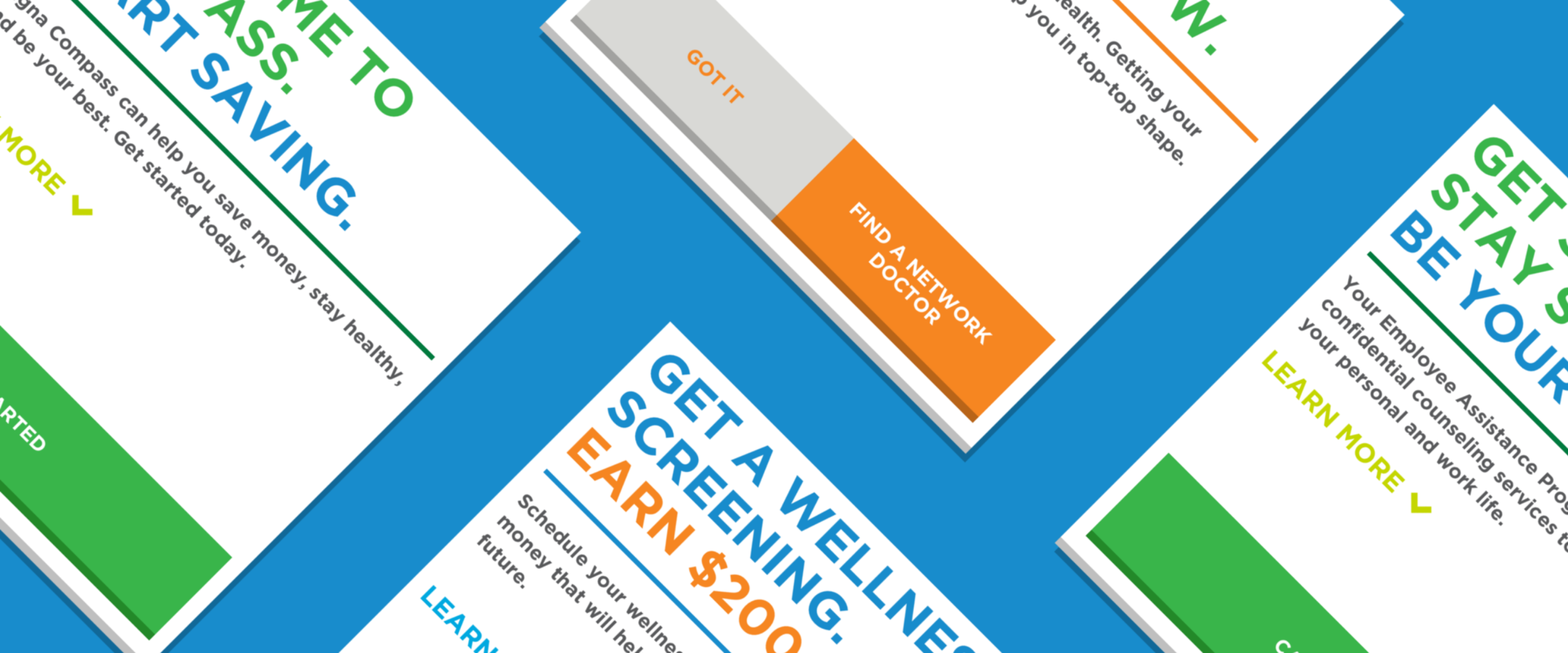
A card model delivered simple, contextual next-best-actions to users in a way that was visually punchy but also restrained.
One Guide: Feature Workshopping & Prototype
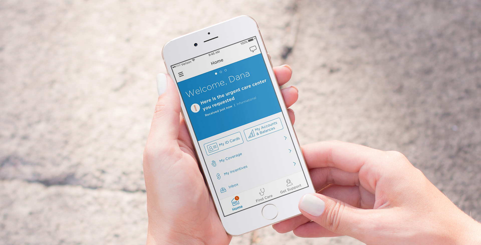
About a year later, Cigna wanted to build upon the success of Compass and go beyond recommendations and anticipate customer needs with a new digital offering. Our engagement continued with a deep discovery process and a prototype that would help them promote the idea internally.
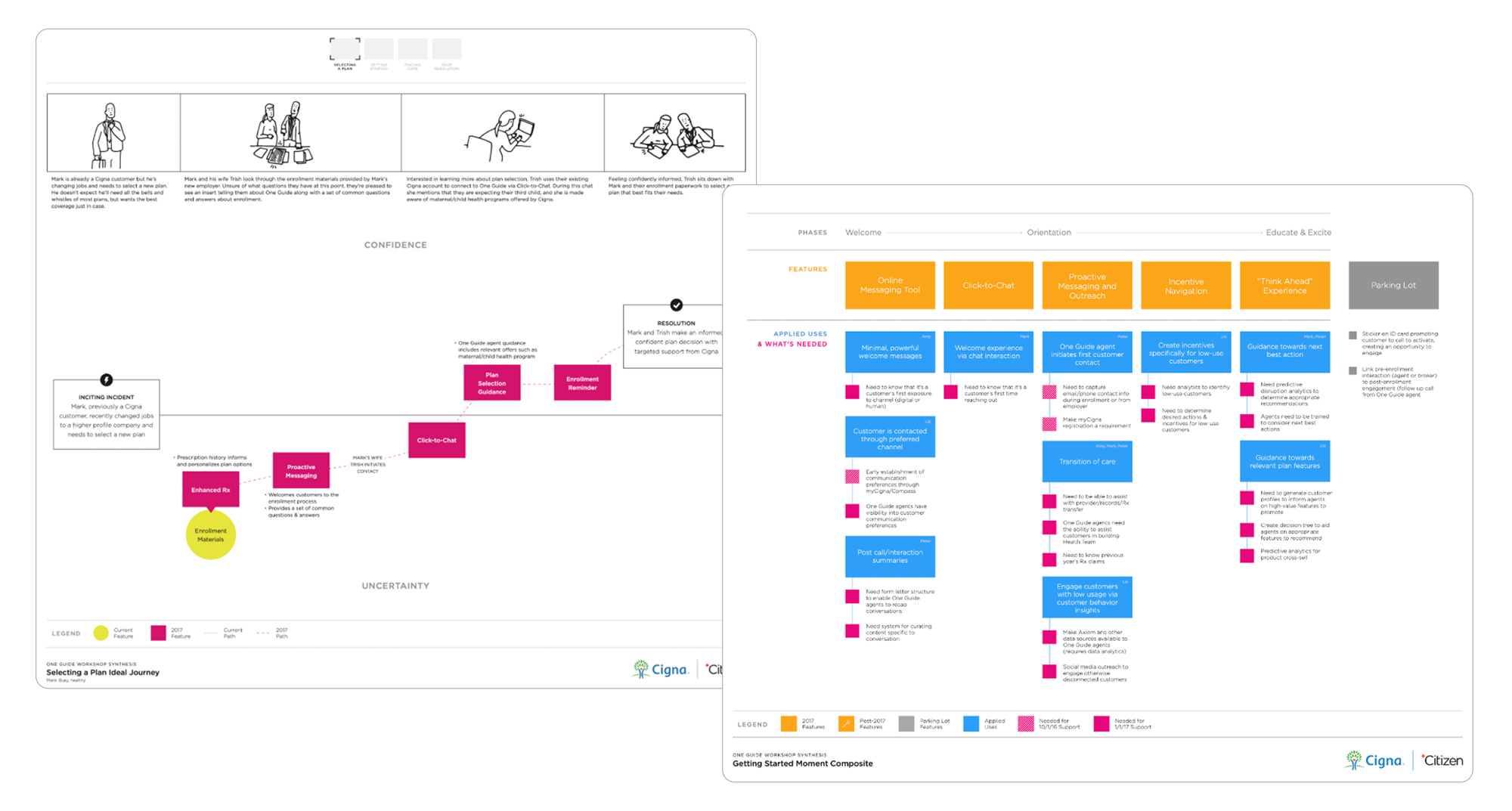
We ran a 2-day workshop with over 40 Cigna stakeholders to map key healthcare moments and features that might unlock them. This mapping helped us prioritize which features mattered to which customers, and when. If Cigna’s systems knew a customer had surgery scheduled, we could proactively surface expected costs and a prep checklist before they asked for it.
Outcomes
Compass
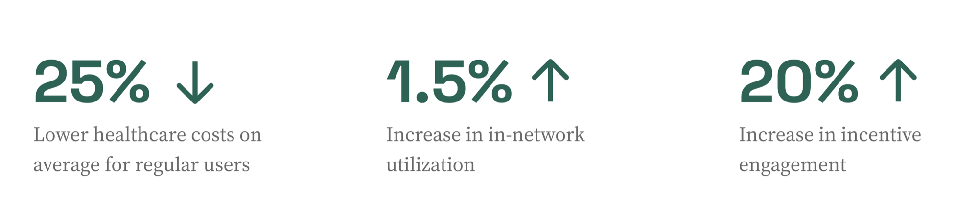
Compass was a measurable success for their large enterprise client, guiding users to stay in-network, take suggested screenings, and earn health incentives.
- 25% lower healthcare costs on average for regular users
- 1.5% increase in in-network utilization
- 20% increase in incentive engagement
- Expanded from one client to 20+ enterprise clients
One Guide
The One Guide features and prototype evolved into a more personalized offering that lives within the existing myCigna app as an add-on for their customers. On average, Cigna clients who included One Guide in their plans saw:
- 3% increase in next-best-actions
- 10% higher engagement rates in health advocacy programs
- 48% increase in mean incentive balance
Takeaways
Research can shape look & feel, not just features
User research for Compass made it clear that there was no shortgage of healthcare information available. People wanted guidance, not reference material. Those insights informed the roadmap but also the entire visual language of the app: a stripped-down aesthetic with little decoration and no photography.