
Sendoso Design System
- Design System Refresh
- Process & Workflow
Sendoso is a corporate gifting and direct mail platform used by sales and marketing teams to send personalized gifts and swag at scale.
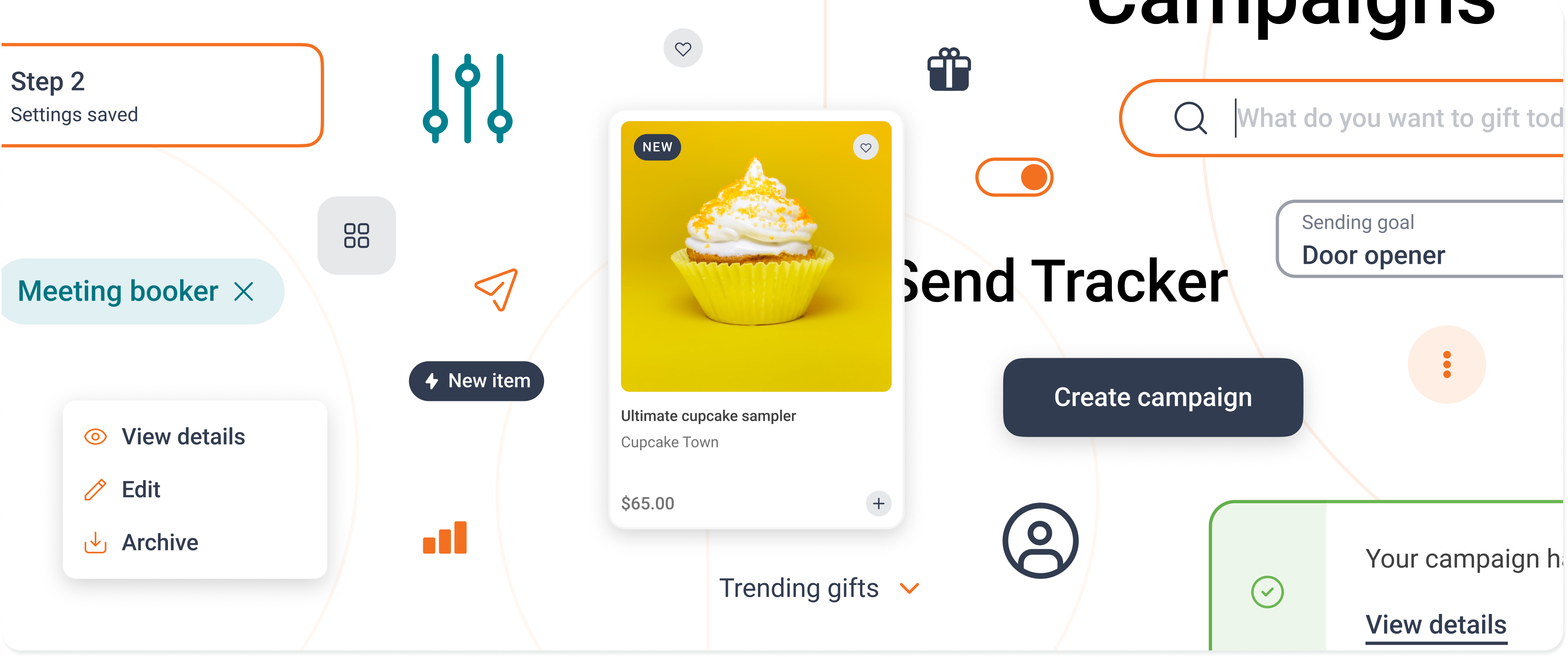
Sendoso's existing system had been built quickly to meet specific, one-off needs, resulting in a cumbersome set of assets that were high on specificity and low on process. Components were inflexible and there was no consistent workflow in place. The new system needed a fresh visual foundation, but the real fix was giving the process the same rigor the components lacked.
Highlights
- Replaced a rigid, ad hoc system with an atomic architecture built for flexible reuse
- Used Tailwind's utility classes as built-in guardrails, cutting decision fatigue on type, shadow, and spacing scales
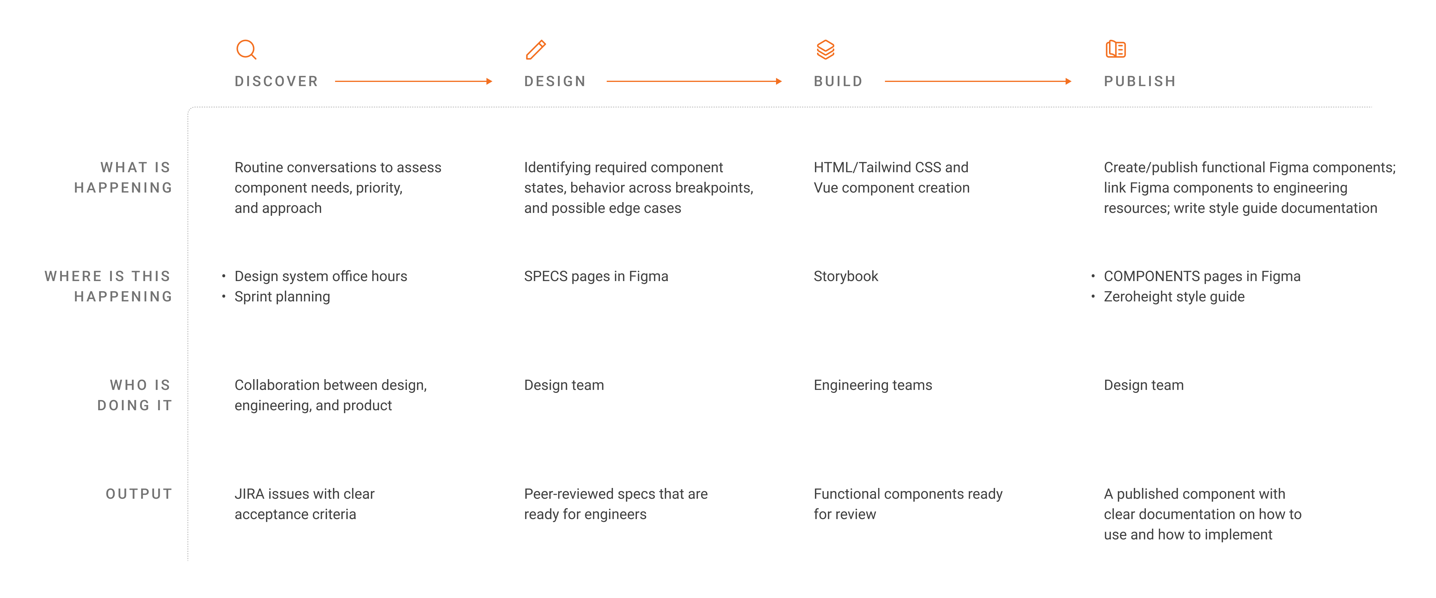
- Structured a Discover, Design, Build, Publish workflow that gave engineering and product full visibility into component status
Problem
The old system wasn’t broken because it lacked components. It was broken because it lacked process: components were built quickly to solve immediate needs, with no shared decision-making about scale or flexibility, and no consistent path from idea to shipped component. A visual refresh alone would have just produced a better-looking version of the same problem.
Process
Visual Alignment
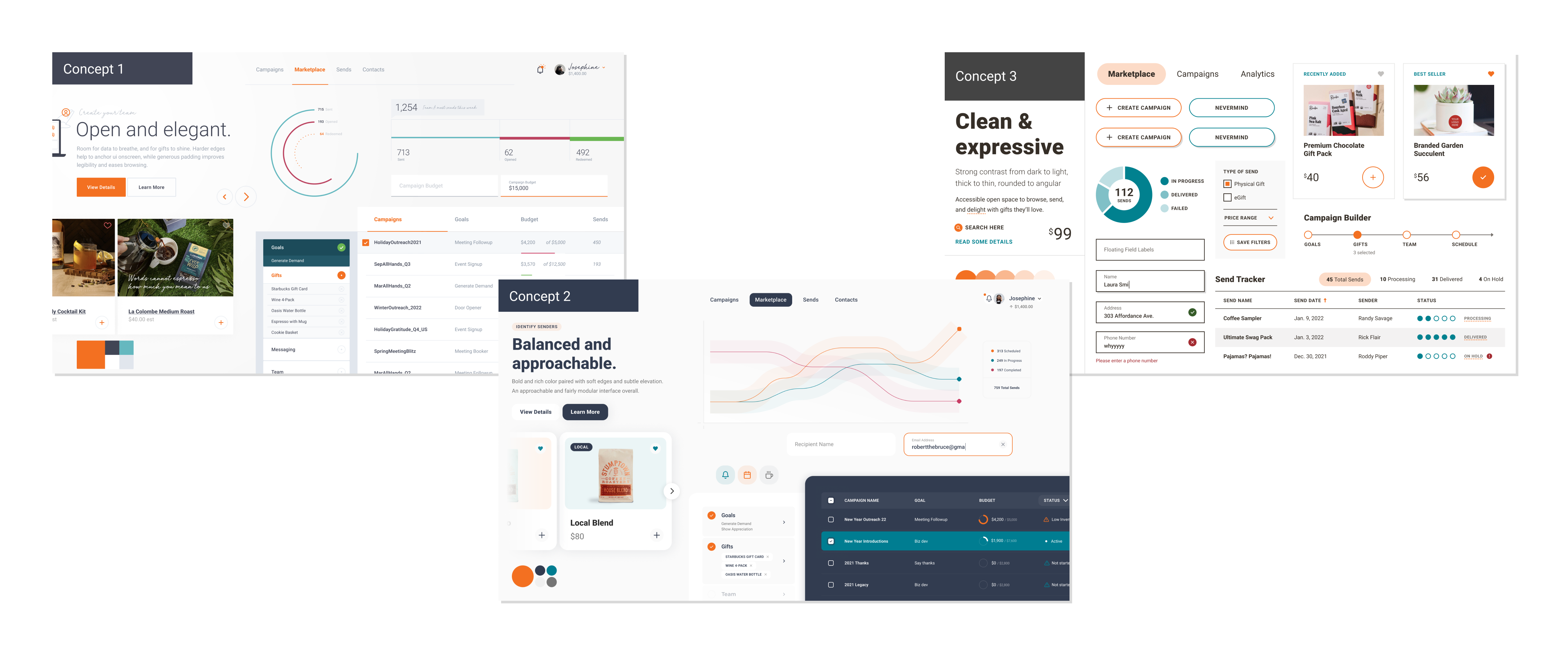
I ran a visual exploration phase with the brand team and design partners, producing three distinct style concepts and putting them to a cross-functional vote across design, product, and engineering.
System Audit
Audited the existing product to define a must-have component list, prioritized with required states, properties, and edge cases.
Tailwind CSS
Used Tailwind as a foundation for style families, treating its existing defaults as guardrails rather than spinning up bespoke scales from scratch.
Process Updates
Restructured the team’s workflow into four phases (Discover, Design, Build, Publish) in Jira, making it clear what stage any component was in and who owned it.
Outcomes
The result was a system that was more consistent component to component, more accessible in color and type usage, and flexible enough to compose new components from existing atoms rather than building one-offs. The structured workflow gave engineering and product visibility into design system work for the first time, closing the gap between design system tasks and individual team roadmaps.
Takeaways
Constraints = Speed
Constraints are a speed enabler, not a limitation. Accepting what the system could already do, rather than defaulting to something new, kept designers building real screens faster. Perfection isn’t the goal either. Components can ship in phases, meeting basic needs first and iterating toward nice-to-haves.