
Product Card Redesign
- Component Architecture
- Content Modeling
Provi is a B2B alcohol marketplace that connects buyers, distributors, and suppliers in a single platform.
The product card was Provi's most-repeated, highest-stakes component, and every version of it had been built separately, with no shared structure to build from. Redesigning it meant fixing not just how it looked, but how it was composed, and I traced that same problem into every other surface using the same underlying data.
Highlights
- Turned a one-off card into reusable, composable sub-components, enabling product displays to be assembled instead of custom-built
- Solved for information parity and more cohesive UX, removing a detour that was causing users friction
- Component approach was foundational in building out a whitelabel storefront experience in just 2 months
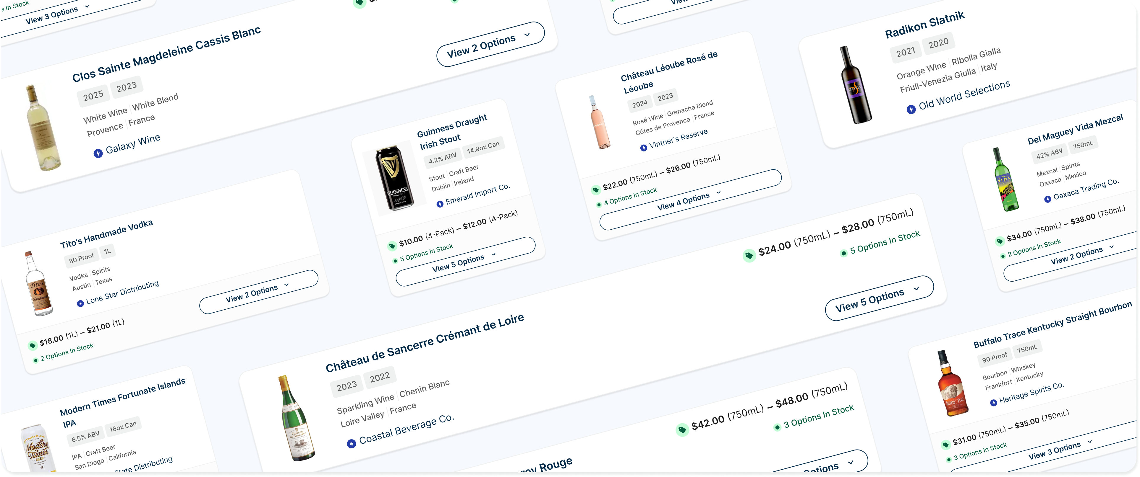
Problem
The product card carried a lot of weight: product line info at the top level, SKU-level detail one layer down, and it needed to work for two different audiences (retailers and distributors) across list view, grid view, cart, and detail pages. But it had been built one variant at a time, with no shared standard underneath.
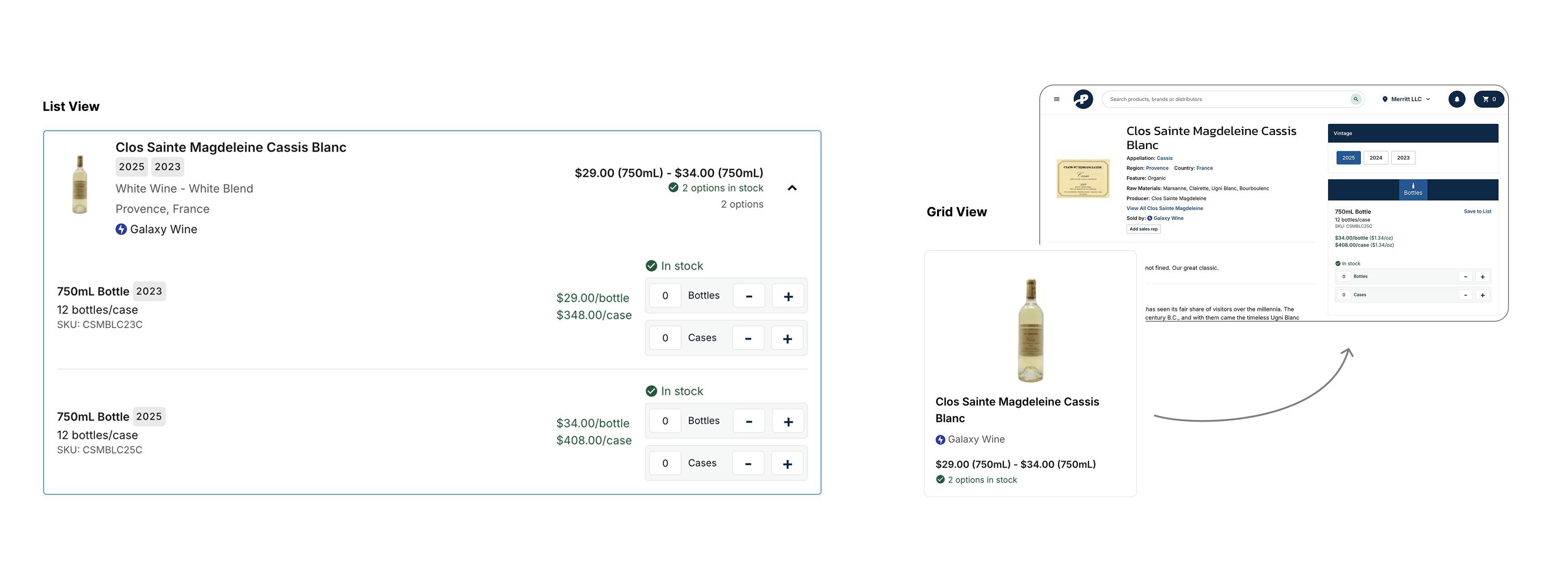
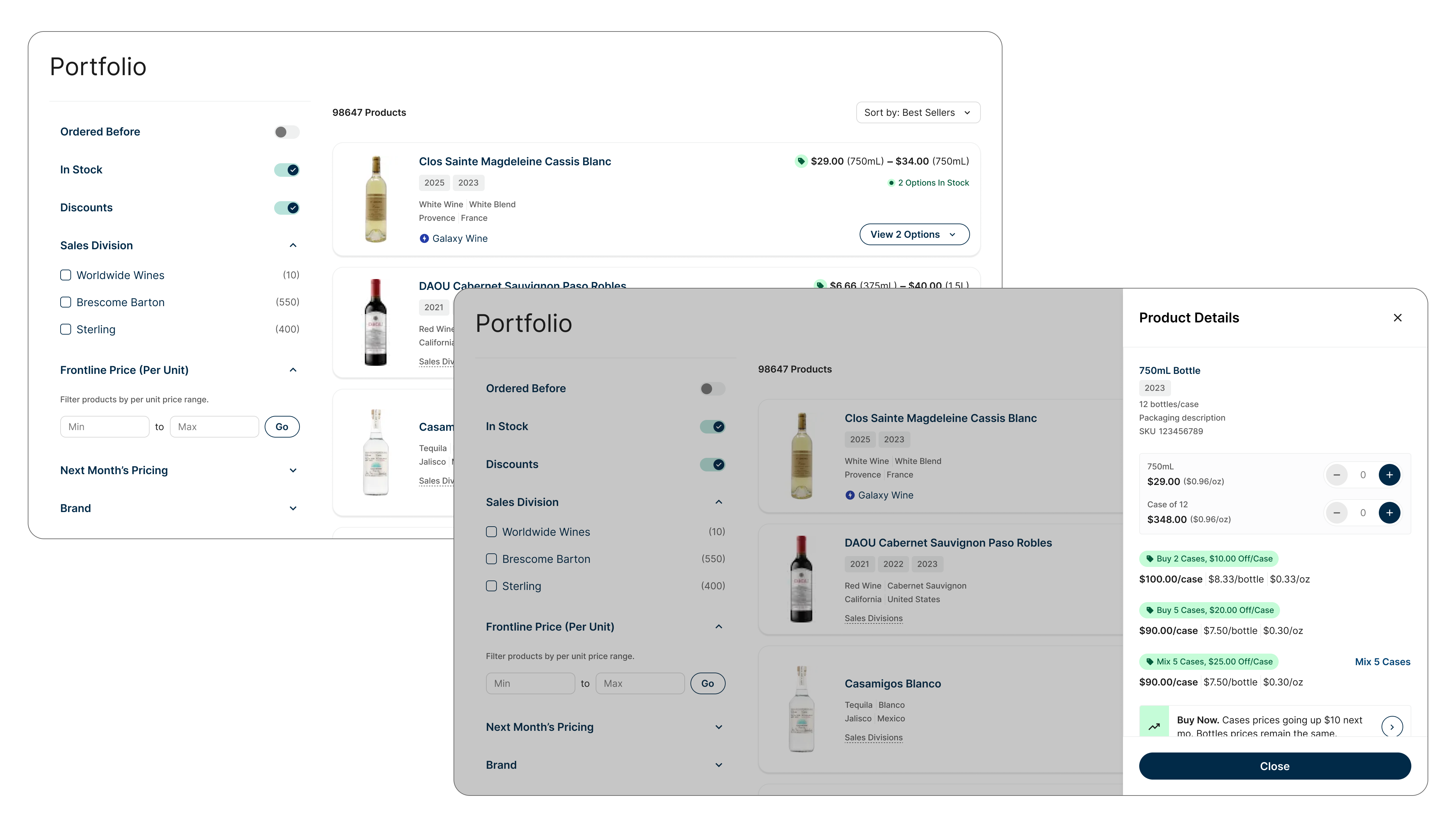
That showed up as real UX gaps, not just inconsistency. SKU-level detail (price breaks, discounts) lived inside the expanded state in list view, but grid view had no equivalent, so users had to leave the page entirely to see pricing they needed. Discounts were prevalent but were only ever indicated by a small icon and label, never surfaced with the weight they deserved given they could change the price by hundreds of dollars a case.
Process
Information Audit
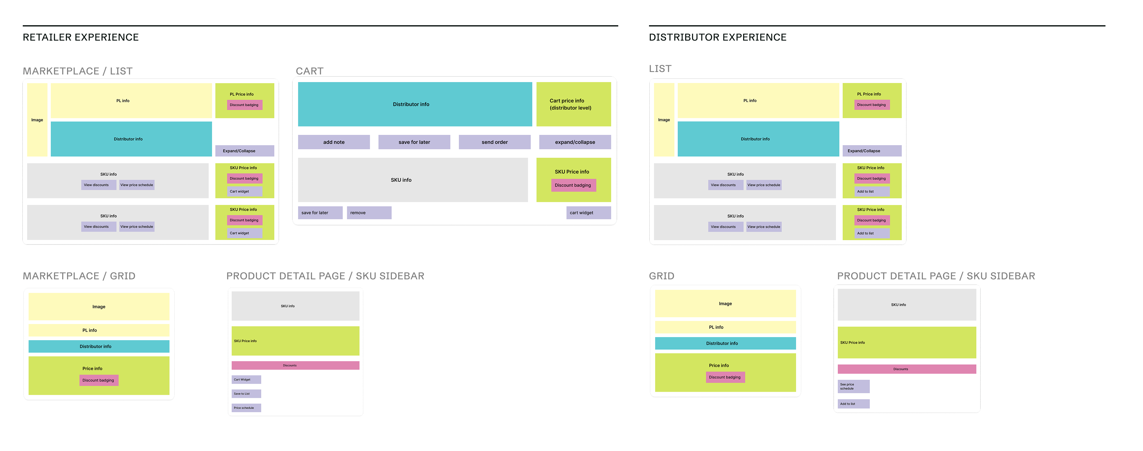
Product cards are just containers for content, and that product content needed to be understood and defined. I audited every place product details and related actions showed up: retailer marketplace list and grid, cart, product detail sidebar, and the same set again for distributors. Laying those out side by side made the structural problem visible in a way that looking at any single card couldn’t: the same information was represented completely differently depending on where you encountered it.
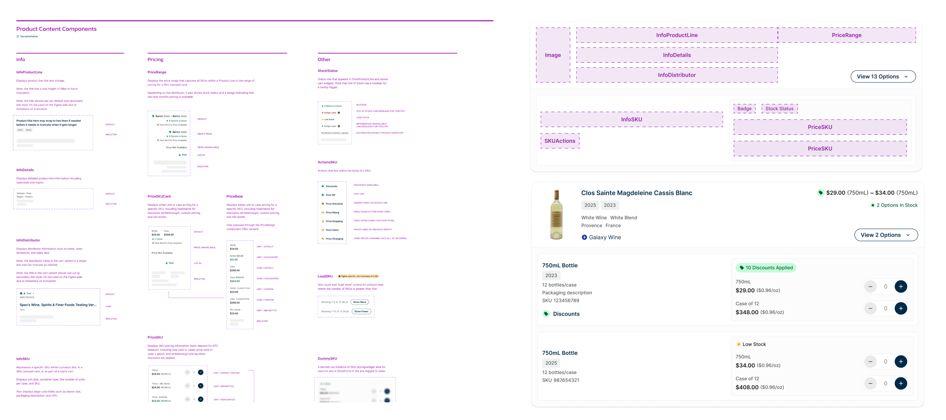
Product Content Components
Product details were then bucketed into content categories which then translated into a set of components to more flexibly display product information: InfoProductLine, InfoSKU, PriceRange, PriceSKU, and so on. Cards themselves became shells that composed these pieces, rather than being built and maintained as monolithic, one-off variants.
Outcomes
The redesigned card gave retailers and distributors visual and functional parity across list and grid views, something the original component never had. Discount information moved from a small icon buried in the card to a first-class, visible element accessible without leaving the page. And because the card was now composed from reusable content components, new displays for product information became unlocked (cart cards, sidebar cards).
This card approach became the foundation of a new whitelabel storefront experience. We were able to build & launch this product in 2 months largely because a core challenge — representing product content flexibly across contexts — had already been solved.
Takeaways
Treat content atomically, not just UI
It’s tempting to componentize by what a card looks like: this container, that badge, this layout. Bucketing by content type instead (product line info, pricing info, distributor info) meant the components were built around what the data actually was, not how one particular screen happened to arrange it. That’s what let the same pieces recompose cleanly across list, grid, cart, and detail views instead of needing a bespoke variant for each.