
Craft Design System
- Design System Refresh
- Planning & Roadmap
- Education & Awareness
Provi is a B2B alcohol marketplace that connects buyers, distributors, and suppliers in a single platform.
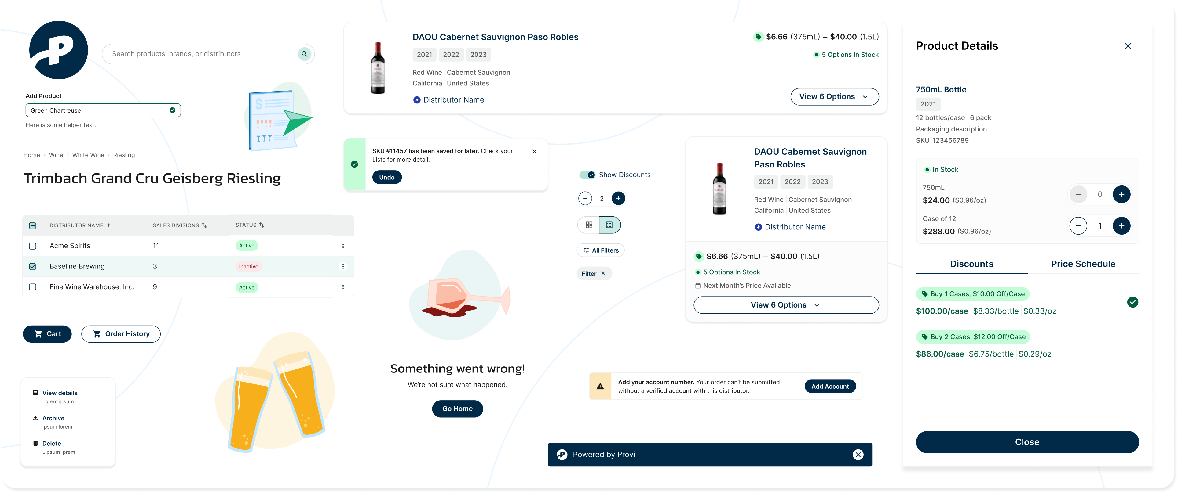
Provi's existing design system, Fizz, was put in place without standards that would help it scale meaningfully. Naming conventions and tokens weren't well-defined and contributions over time were ad-hoc. Without guardrails in place, the system became bloated with a sizeable gap between design and code — and leadership needed a clear case for why a system rebuild was worth the time and resources before committing to it.
Highlights
- 0–1 system build with a dedicated engineering partner
- Built trust across the org with a detailed roadmap, sequenced rollout, and POC to validate ease-of-use
- Powered a new full product build in 2 months
Problem
Introducing the new system, Craft, was as much a 0-1 build as it was a confidence-building exercise. Any new system would only get resourced and adopted if it could show its work: a clear plan, low-risk validation, and proof it wouldn’t repeat Fizz’s drift before asking for a bigger commitment.
Process
Library Selection
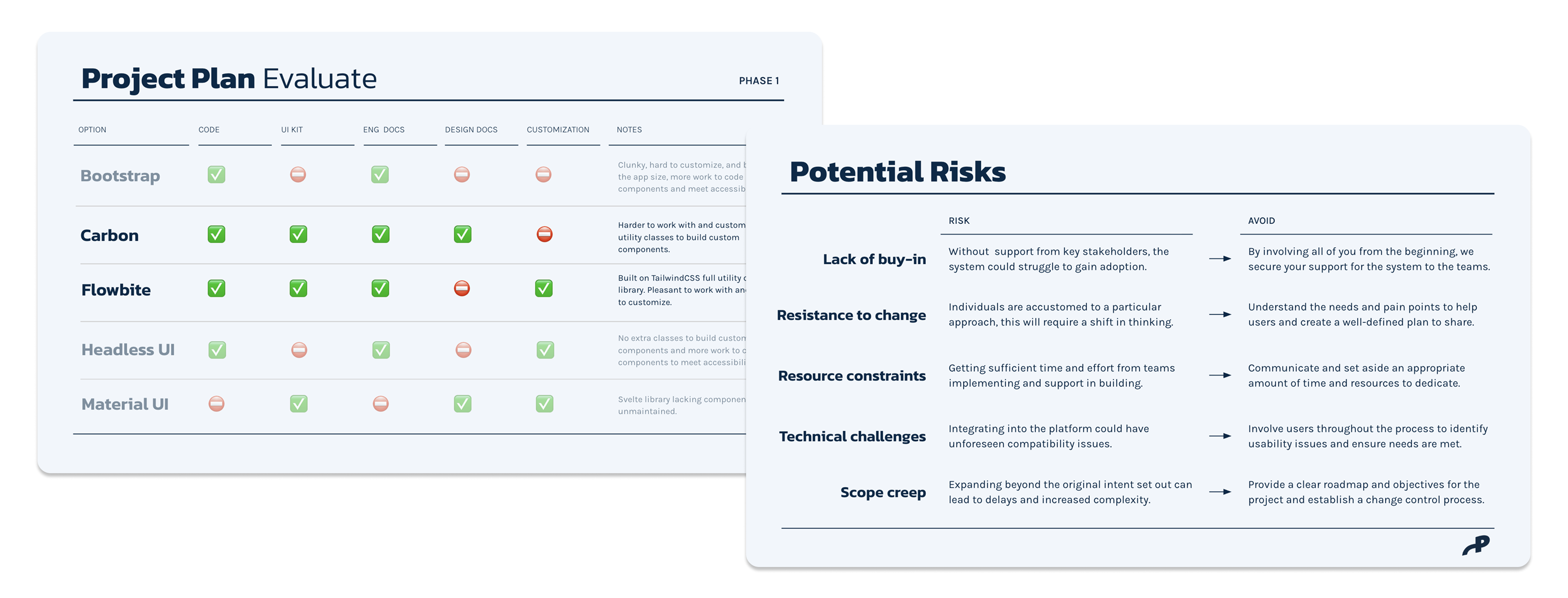
I worked with a dedicated engineering partner to evaluate 5 libraries against code, docs, and customization needs before landing on Flowbite as a system starting point.
Risk Identification
We mapped adoption risks to mitigations up front — buy-in, resistance to change, resourcing, scope creep — so leadership’s objections had already been answered before asking for commitment.
Detailed Project Plan
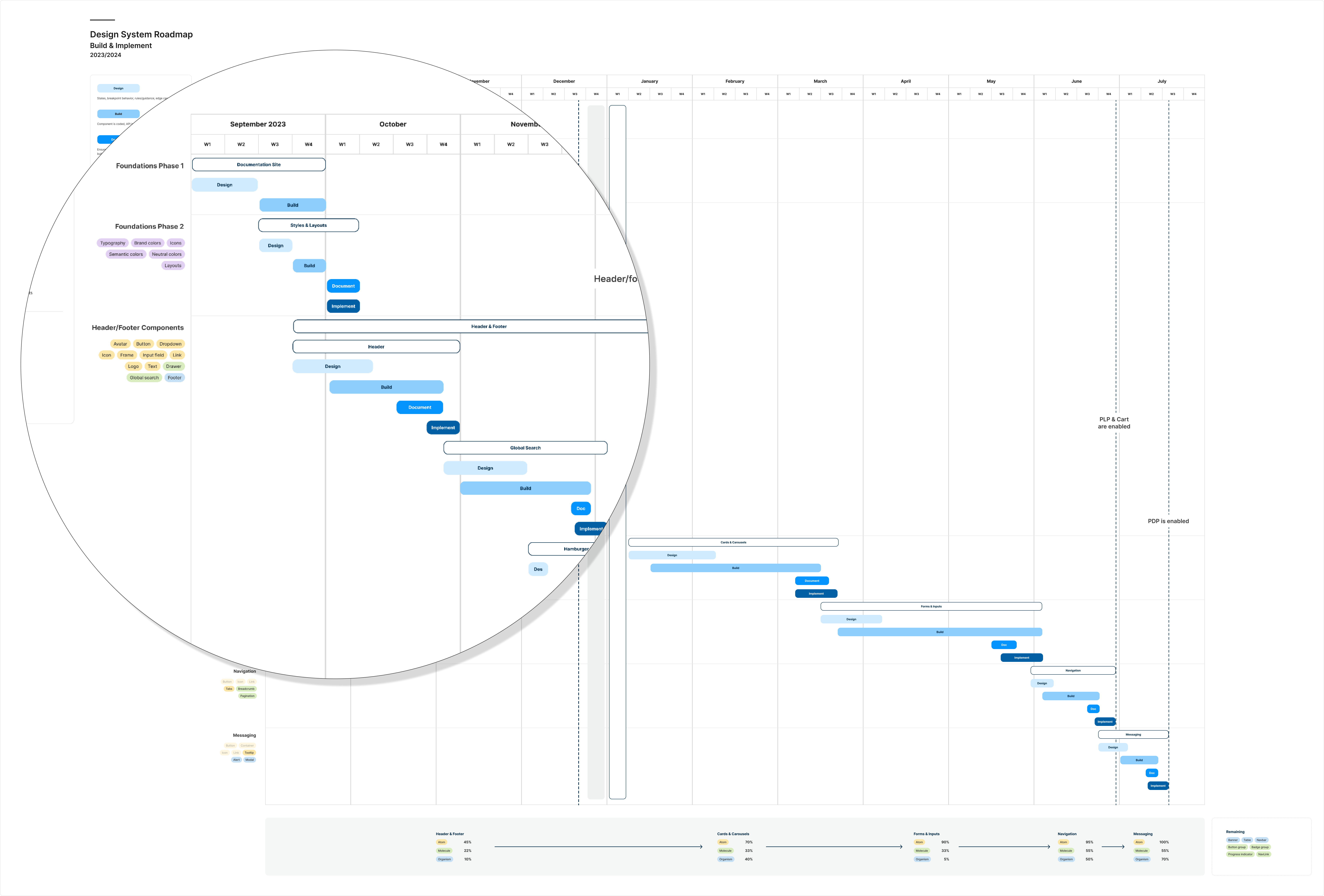
The rollout was sequenced in phases with a public roadmap: foundations (naming, tokens, documentation site) → POC → new product build, with milestones marking when key elements would be enabled.
Proof of Concept
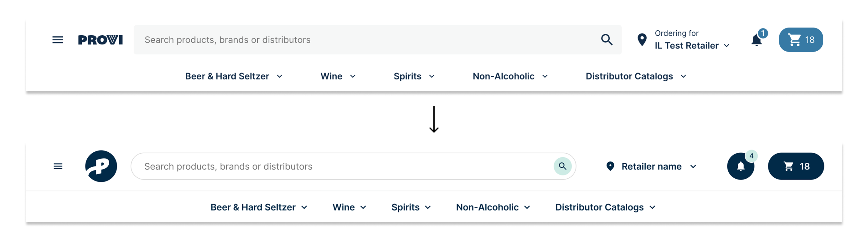
We released an updated global nav to soft-launch the system and evaluate engineering ease-of-use and “do no harm” usability standards.
Education & Awareness
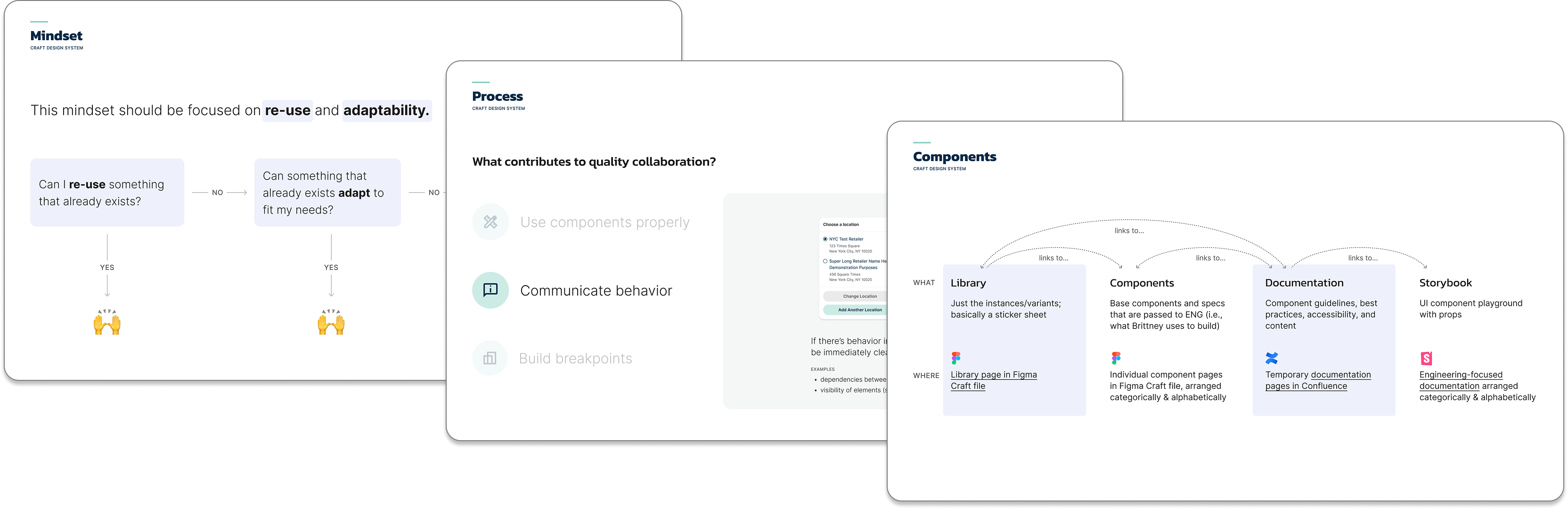
I ran recurring “Sandbox Series” sessions to build team fluency in contribution and handoff, not just usage.
Outcomes
Transparency around the process — the detailed roadmap, risk mapping, education sessions — built the confidence leadership needed to back the rebuild. The nav soft-launch then proved it out, matching the original’s usability based on click tracking metrics. That foundation went on to power a new full product build in 2 months.
Takeaways
Adoption isn’t Automatic
Getting others to embrace a new system is something you earn, staying accountable and making the process visible along the way. Roadmaps, risk mapping, and staged proof points did as much to ensure success as the quality of the system at the token & component level.
Beware Specificity
Component flexibility is always top-of-mind from a UI element standpoint, but I built some components with too much specificity around business logic. A retail location switcher, for example, didn’t always conveniently present a retail name and address in the dropdown. This was a good reminder to think about the data coming in and validate components not just with engineering, but with internal SMEs as well.